
Coco Coffee House, a women-only social platform by Women In Work, had a clear mission. But members were forgetting their paper vouchers and struggling to make meaningful connections. I embedded myself in the community to redesign the experience and help the startup build sustainable product practices.
Research & Insights
Coco wanted to help women professionals connect, so I spent time in the community to understand how people actually used the app.
Participatory Observations
- Attended 2 offline events to watch how members interacted with the app in person
- Joined the in-app group chat to catch organic feedback and complaints as they happened


Stakeholder Interviews
- Talked to co-founders about member behaviours and company values
- Reviewed member feedback that the team had already collected
Key Insights
- Physical-digital disconnect: Members loved the in-person events, but the paper voucher system created friction. Each member carried 4 physical vouchers per month. They forgot them, while the staff spent time tracking quotas.
- Contextless matching: The original matching showed profiles without shared interests or activities. Members didn’t know how to start conversations, leading to stalled connections.
Beyond the UX issues, the team was a startup with limited product experience. Requirements shifted. Releases were ad hoc. This added complexity to the design work.
Design Process
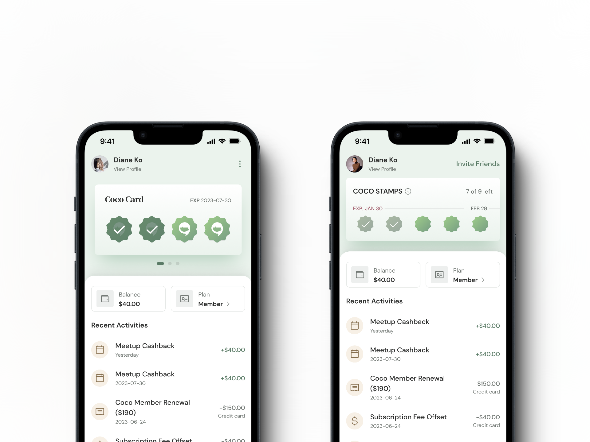
Digital Stamp Card
Members liked the loyalty program concept. It felt familiar, but they hated dealing with paper. Therefore, I designed a “digital stamp card” that kept the same mental model while removing the physical barriers:
- View attendance history and remaining stamps (quota)
- Top up beyond the monthly limit when they wanted more events
- See expiry dates at a glance
Humanising the Matching Experience
The original matching felt transactional. I redesigned it around trust and shared context:
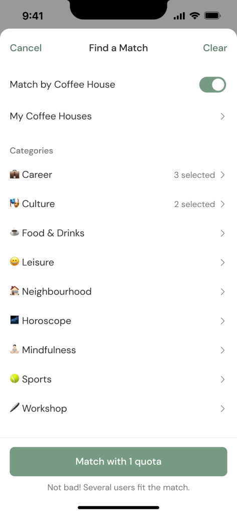
More relevant matches based on shared interests and group activities.
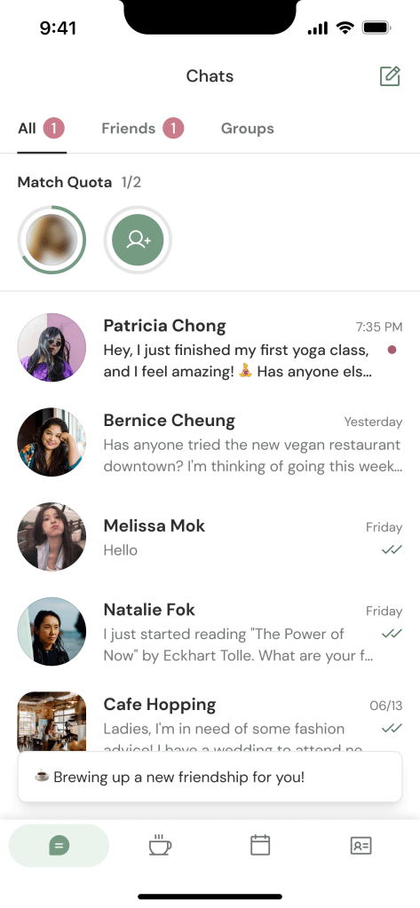
Easier access by moving matching into the Chats tab, reducing context-switching.
Story-like progression with circular indicators and hidden profile photos to build anticipation.
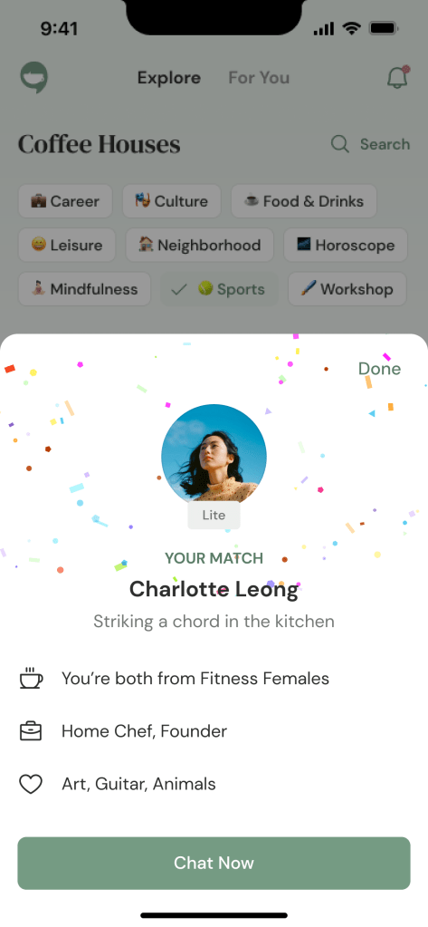
A moment of celebration with confetti and highlighting common interests when a match occurs.
Subscription Transition Strategy
As Coco moved toward a subscription model, I designed the communication strategy:
How to upsell subscription without alienating the existing community?
The Approach:
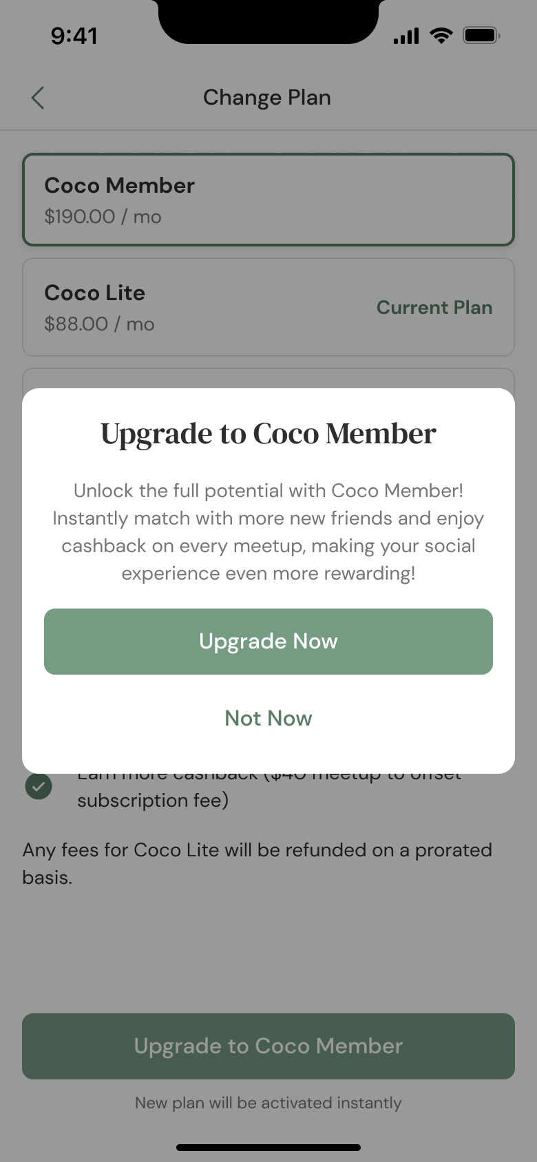
Framed the subscription as “unlocking more connections” rather than “paywalling existing features”
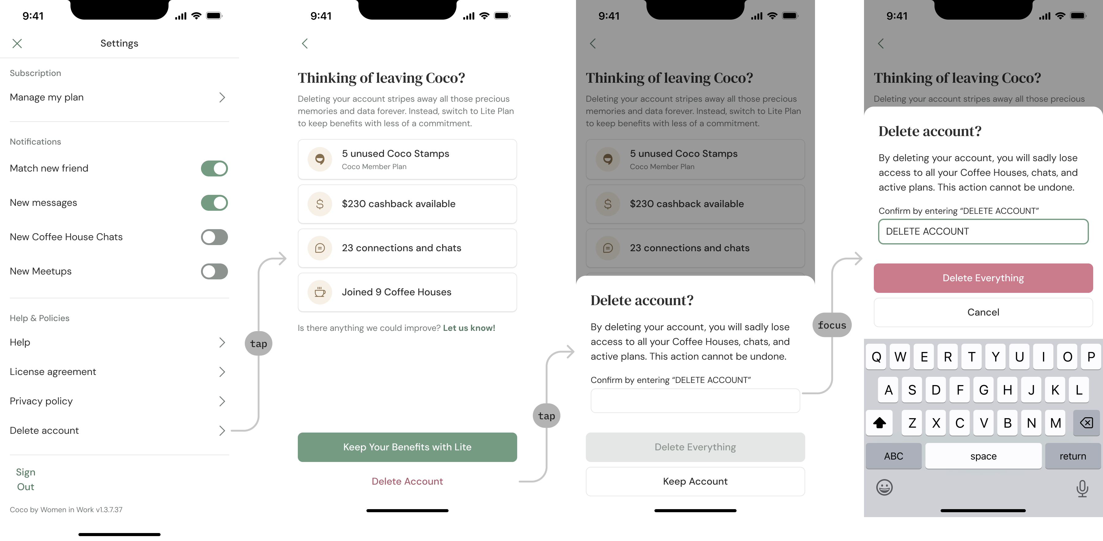
- Designed a downgrade path that was more visible than account deletion (reducing churn);
- Added a feedback form (“Let us know” on the second screen) when users attempted to delete accounts, turning exits into insights
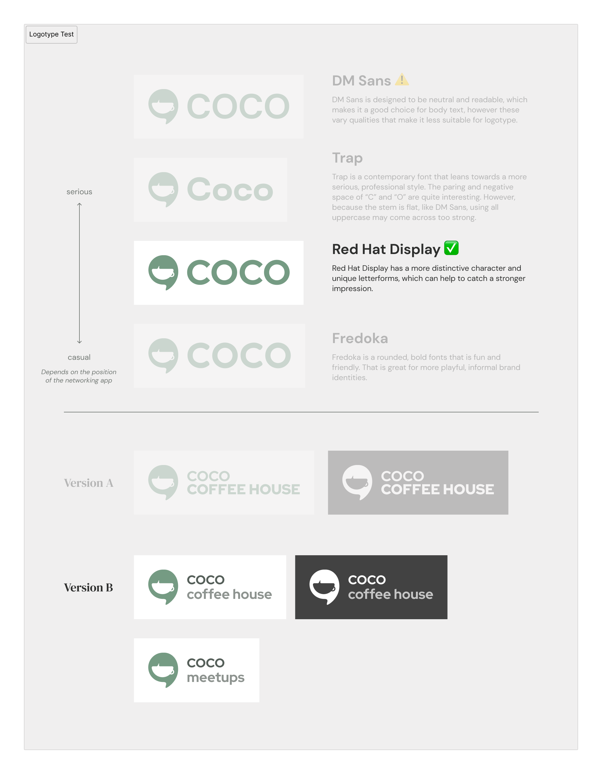
Brand Refresh
The original branding felt transactional rather than welcoming. This didn’t match Coco’s
mission of warmth and inclusivity.
Updates:
- Logo: Created logo lockups paired with the new logotype
- Colour: Shifted to a soft green palette that kept the “coffee house”
feeling while improving accessibility (WCAG AA compliant) - Typography: Paired elegant sans-serif for readability, with serif headings for
sophistication, balancing approachability with professionalism - Illustrations: Added soft greenery motif to reinforce the “organic,
growing community” concept
Constraints & Collaboration
Working with a startup meant extending design beyond screens into process.
Clarifying Requirements
The team had ideas but limited product experience. I facilitated discussions to clarify:
- Each page’s core purpose and hierarchy;
- Whether feature requests matched user needs and technical constraints;
- Trade-offs between ideal UX and feasibility.
Supporting Implementation
During handoff, I:
- Provided feasible technical recommendations, not just design specs;
- Shared component library references and implementation examples;
- Suggested phasing strategies when constraints emerged.
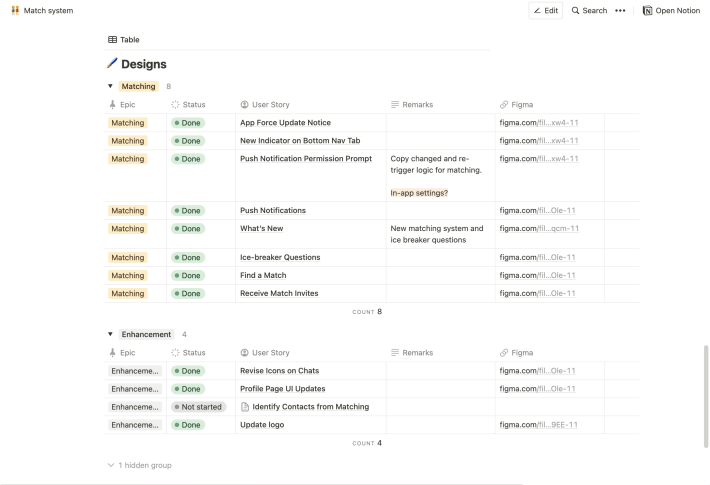
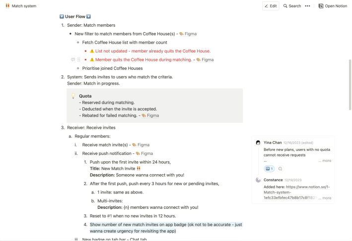
Establishing Documentation
I set up a Notion workspace with:
- Feature requirements;
- Feature tracking board showing what was in progress, blocked or deprioritised;
- Edge case documentation to reduce back-and-forth.
What I Learned
- Familiar patterns reduce friction. The stamp card metaphor worked because members already understood loyalty programs. Meeting users where they are, mentally, is often more effective than inventing new interactions.
- Design for what comes next. Clear visibility (expiry dates, remaining stamps) and small celebrations (confetti on match) keep engagement feeling natural rather than forced. Anticipation is part of the experience.
- Process is product in startups. When the team lacks product experience, establishing documentation and communication practices is as valuable as the design itself.
Outcomes & Impact
- Members reported that the digital stamp card eliminated the problem of forgotten vouchers.
- The new matching was described as “more thoughtful” and “easier to start conversations”.
- Created reusable component patterns that speed up subsequent feature development.
- Designed retention-focused UX to support the subscription model transition
While my involvement ended, the redesign addressed the core friction points and brought Coco closer to its mission of safety and connection.
| My Role | Freelance Product Designer (with PM & technical strategy responsibilities) |
| Team | 2 co-founders, 1 developer |
| Responsibilities | Product strategy, UI/UX Design (iOS and Android), brand refresh & visual identity, PRD documentation & requirements clarification |
Need a design strategist to create user-friendly solutions? Let’s connect!
