
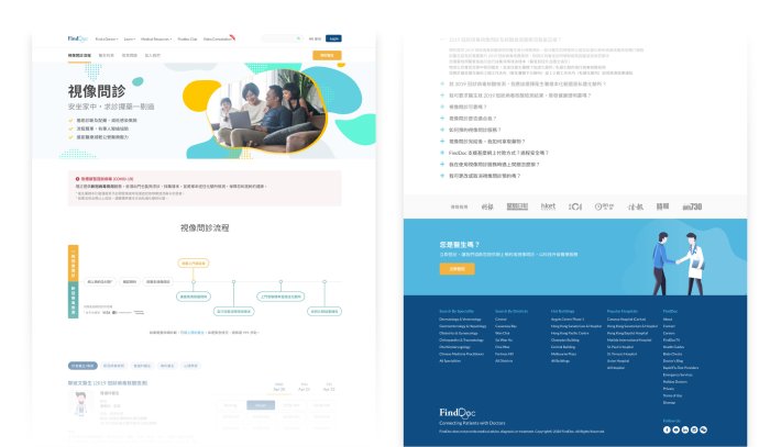
COVID-19 forced FindDoc to launch video consultations in 2 weeks to keep remote healthcare accessible. The service worked, but the landing page confuse users. I redesigned the page to clarify the value, streamline booking and build trust.
The Challenge
FindDoc needed video consultations fast. Early analytics revealed friction of the original landing page:
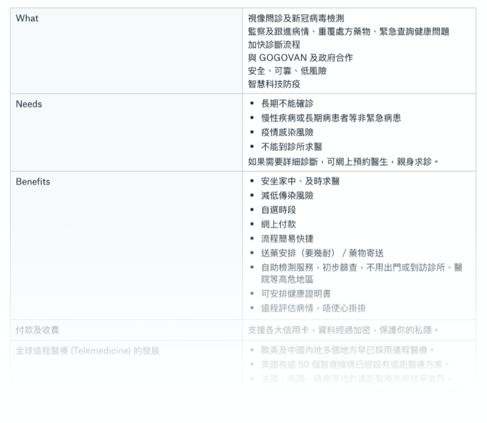
- Unclear value: Users did not understand “video consultation” or how it differed from COVID-19 testing.
- Broken booking: Users scrolled through 50+ time slots, then abandoned. Heapmap showed rage clicks.
- Trust gap: Outdated FAQs and no visible credentials weakened confidence.
If users could not book easily, they would abandon telehealth or switch to competitors.

Research
I had 3 days. I used Google Analytics, Hotjar, competitor audits.
- Finding 1: Users landed on the page, saw “video consultation” and assumed it meant COVID-19 testing. They left when they realised it was not.
- Finding 2: Users scrolled through 50+ time slots, then quit. The cognitive load was too high.
- Finding 3: Patients worried about doctor qualifications and data privacy. The page showed neither.
Design
1. Clarify the Value Proposition
Before: Vague headline plus “Learn More” button hiding the explanation.
After: Immediate value communication with localised, scannable messaging:
- Traditional Chinese: “一剔過” (one top and done)
- Simplified Chinese: “一点通” (one click to connect)
These phrases convey speed. Users scan them in under 3 seconds.

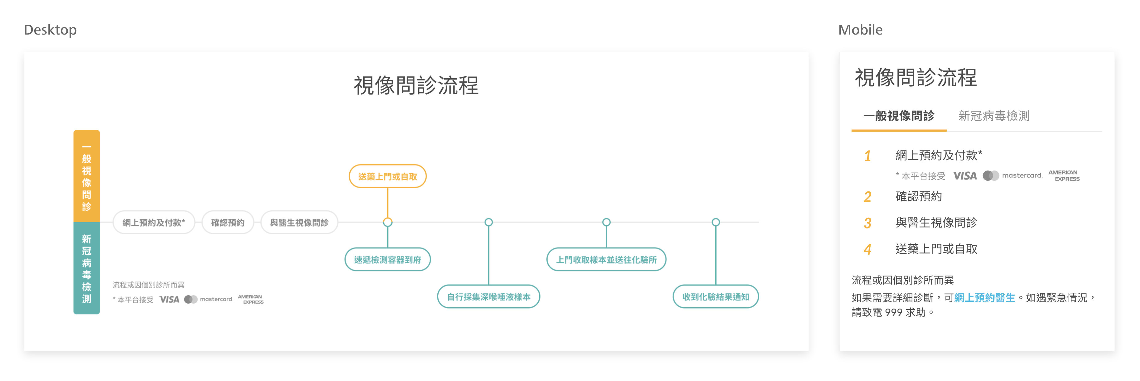
2. Visualise the Process
I designed the interactive flowchart for desktop and a step-by-step tabbed guide for mobile. This showed exactly what would happen:

3. Navigation That Works With You
I introduced a sticky navigation bar so users could jump to what they needed instantly. A persistent “Book Now” button kept momentum going, while doctor affiliations and media mentions added reassurance at key decision points.

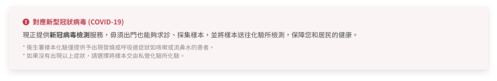
COVID-19 Notice – Users informed about testing availability.

Highlighted media mentions & expert endorsements to reinforce credibility.

Introduced doctor affiliation details to build trust.
4. Build Trust
FAQs were rewritten and expanded based on real user questions. I also optimised headings, metadata and structure to improve SEO and added new analytics to track engagement after launch.
Results
| Metric | Change |
|---|---|
| Desktop bounce rate | −21.63% |
| Mobile bounce rate | −18.98% |
| Desktop session duration | +1 minute |
| Mobile session duration | +2.2 minutes |
Learnings
Trust is visual and specific. Doctor credentials and media mentions had more impact on conversion than UI polish. Users needed to see “this is legitimate” before they would book.
Localization is strategy. The Chinese taglines were not translations. They captured cultural nuances about efficiency that resonated with Hong Kong users.
| Company | FindDoc |
| My Role | Product Design Lead |
| Platform | Website |
| Responsibilities | UX Research Responsive Design Content & Copywriting SEO Analytics Multilingual Translation |
Need a design strategist to create user-friendly solutions? Let’s connect!
