
Cathay Pacific Shopedia+ App Redesign
Redesigned a mission-critical crew-facing app to assist passengers with duty-free purchases mid-flight. The original interface created friction during high-pressure service scenarios.
Problems
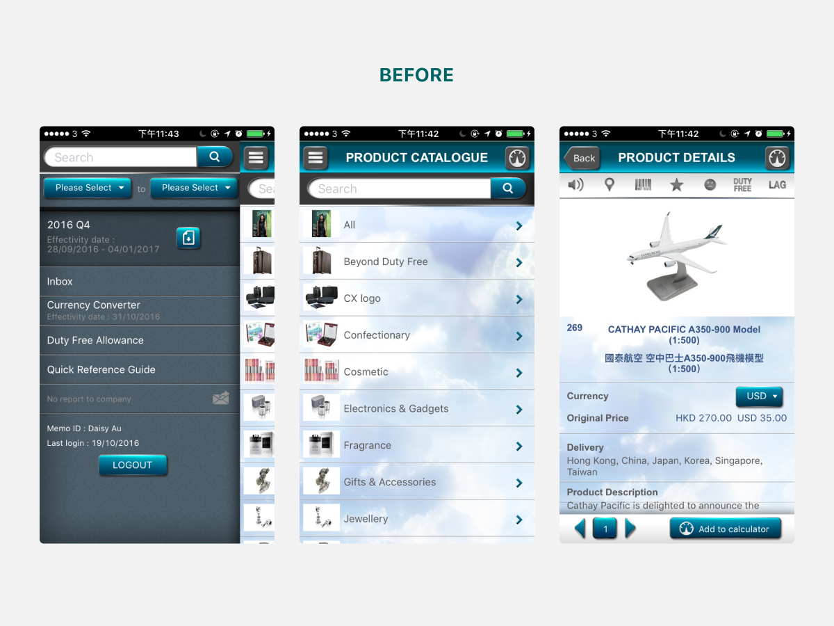
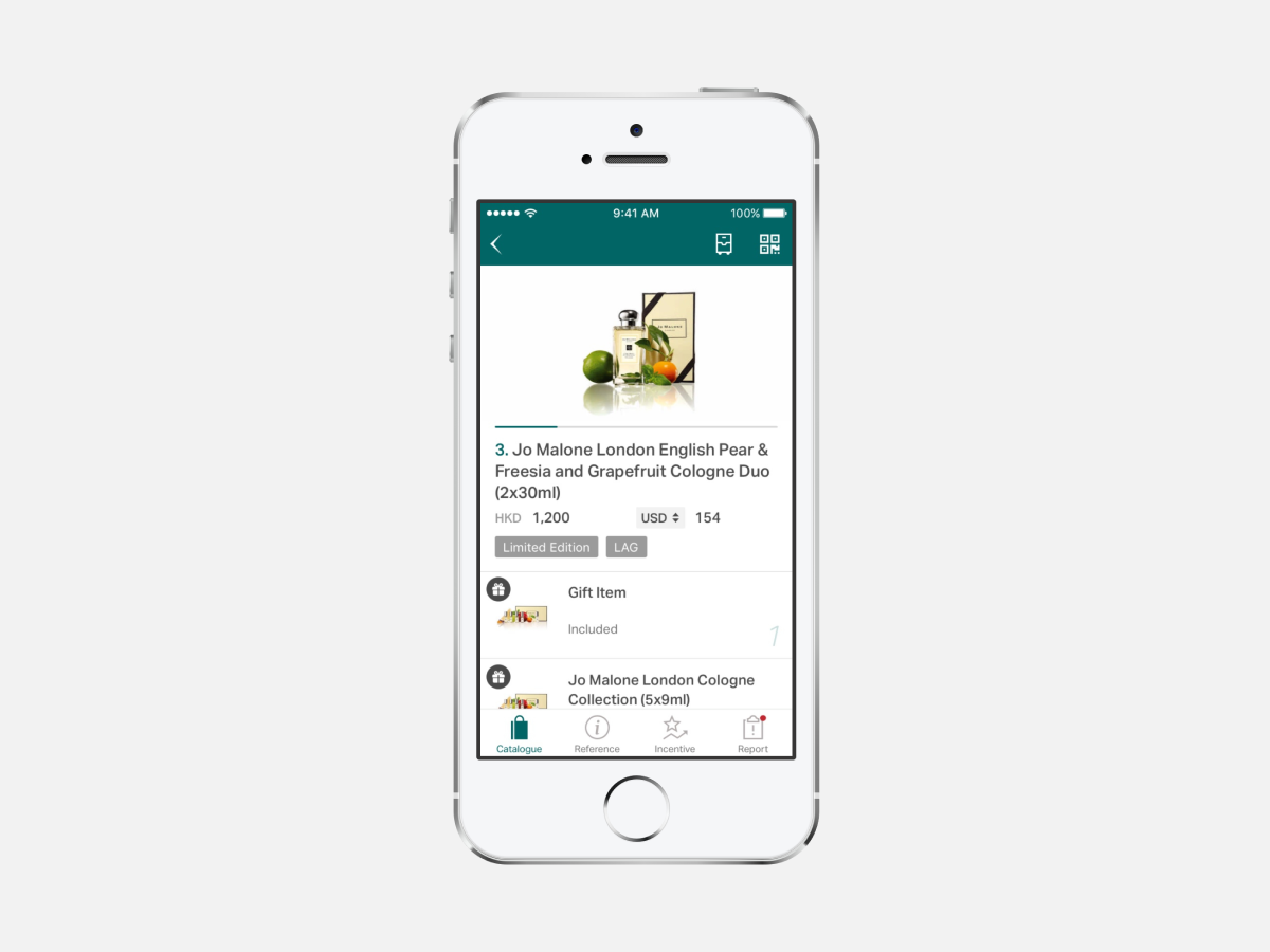
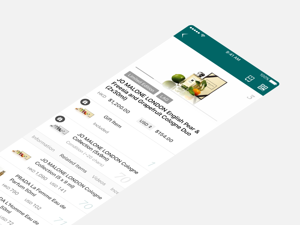
Cabin crew relied on the Shopedia+ app to browse product catalogues, verify inventory and process duty-free sales during flights. However, three critical issues undermined its effectiveness:
Cognitive Overload During Service
The dense, outdated interface forced the crew to spend excessive time hunting for product information—time taken away from passenger service. In the confined, time-pressured environment of an aircraft cabin, every extra tap and scroll compounded frustration.
Unintuitive Information Architecture
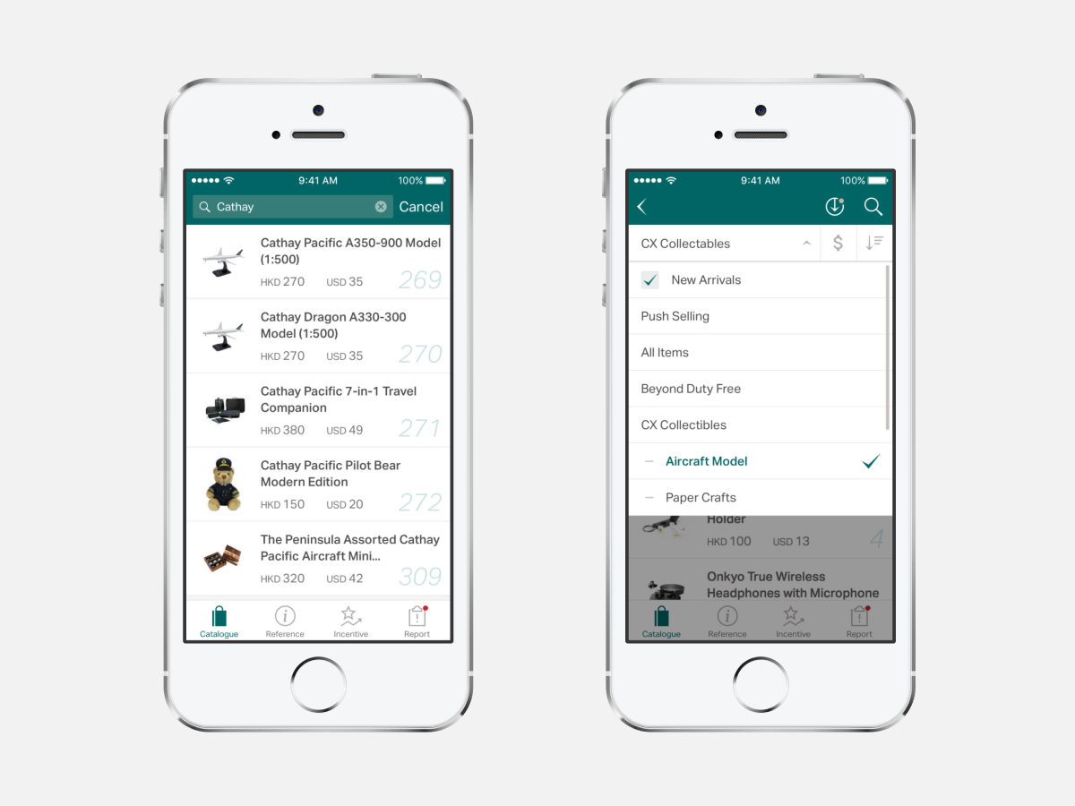
The original navigation structure didn’t align with how the crew actually thought about products. Finding a specific item required navigating multiple screens.
Feature Bloat
Some of the features were rarely used. This clutter obscured the features crews actually needed, increasing decision fatigue during service rounds.
Poor app performance didn’t just frustrate the crew. It directly impacted passenger experience and duty-free revenue, a significant ancillary income stream for the airline.
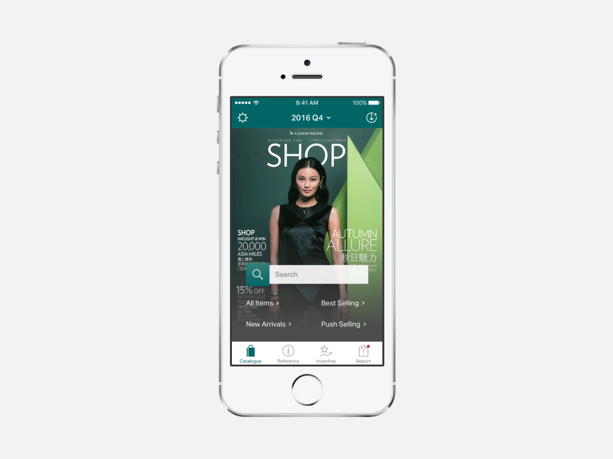
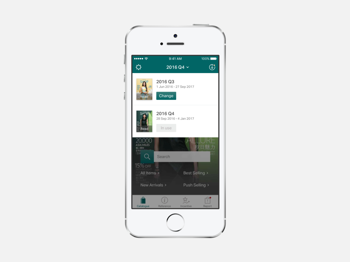
Solutions
| Client | Cathay Pacific |
| Year | 2016 |
| Role | Design Lead at Zensis |
| Scope | UI design, icon design, iOS & Android |
| Team | Collaborated with PM, engineering lead and Cathay Pacific’s cabin crew stakeholders |
Need a design strategist to create user-friendly solutions? Let’s connect!
