HKT Education appointed us in March 2015 to create a flipped classroom learning platform to promote active online learning. The Flipped Classroom app aims to collect and digitalise school teaching resources in one location, allowing students to learn independently and easily outside the classroom.
Objective
The primary users of this app are local high school students who are digital natives. With intense workloads from homework, exams and tutorial classes, many students struggle to find time to study using traditional paper notes.
Constraints
The client had already prototyped the platform website at the start of the project, which presented both advantages and disadvantages. This required us to recognise the information, flows and wireframes five times with all stakeholders to find design workarounds.
Solutions
Listing Quizzes
The app includes quizzes on various subjects and topics to assess students’ learning outcomes. To improve the user experience, we implemented the following features:
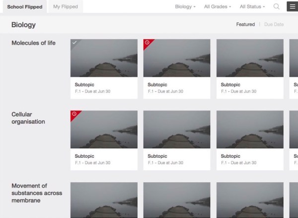
Topic cards: A scrollable grid list with topic cards provides an overview of each topic. Users can quickly locate a topic by scanning the titles. Large images on the card make the experience more engaging compared to a text-based list.
Corner tag: Indicates the completion status of a task. A “late” assignment is highlighted in red, while a “completed” task appears translucent.
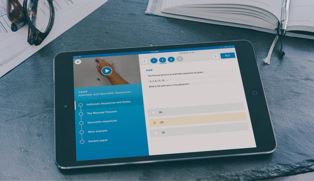
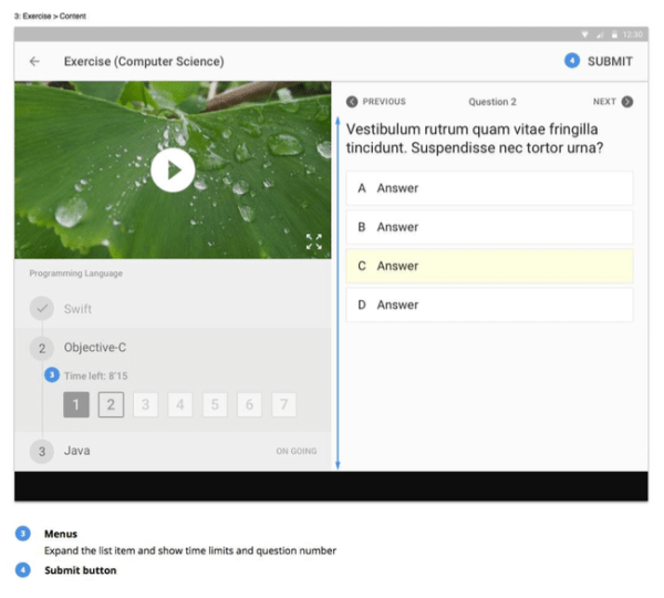
Answering Questions
The app offers five question types: multiple-choice, true or false, fill-in-the-blanks, matching and ordering. Due to time and budget constraints, we opted for a tap-and-go interaction instead of a more intuitive drag-and-drop feature.
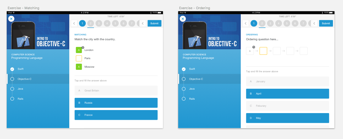
Essential actions, such as options and submit buttons, are placed on the right side, considering users’ clicking and posture when answering questions.
Supplementary information, like the timer or question number, is combined with topics and presented in a timeline to demonstrate the learning experience.
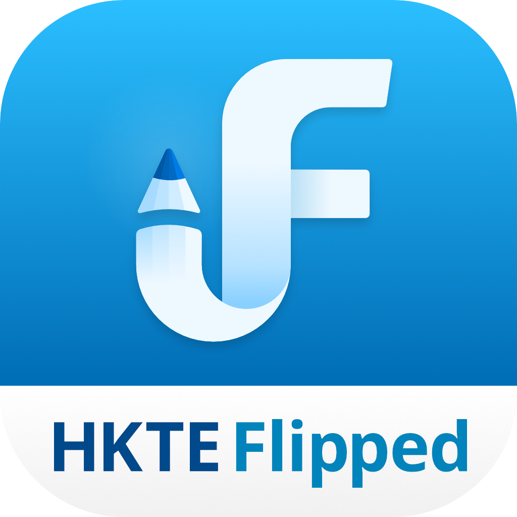
Designing App Icon
Translating “Flipped Classroom” into visuals was challenging. The final icon chosen was an upside-down F-mark, symbolising the “flipped” concept.

Final Thoughts
The most challenging aspect of this project was finding compromise solutions within limitations. We aimed to create a gamified education product, but when that wasn’t possible, we explored familiar patterns for students and translated them into a digital experience. This approach helped us maintain a user-friendly app that was technically feasible and could be delivered on time.
Throughout the process, the client contributed and communicated their needs. Some options differed from ours, but we always tried to persuade them with references or articles to demonstrate professional views rather than random, subjective decisions. While some may believe “design” is subjective, it is based on habit, patterns and cognition about a subject.
| Client | HKT Education |
| Role | Design Lead (Zensis): wireframing, UX & UI, prototyping, app icon design |
| Platform | iOS & Android tablet app |
