
RTHK, Hong Kong’s authorised broadcaster, seeks to create an inclusive news mobile app that caters to diverse user needs. The case study outlines the design process for the platform’s mobile app, focusing on two distinct viewing modes: multimedia mode and simple mode.
Target User Groups
- General public
- Low-vision users
- People with limited cellular data
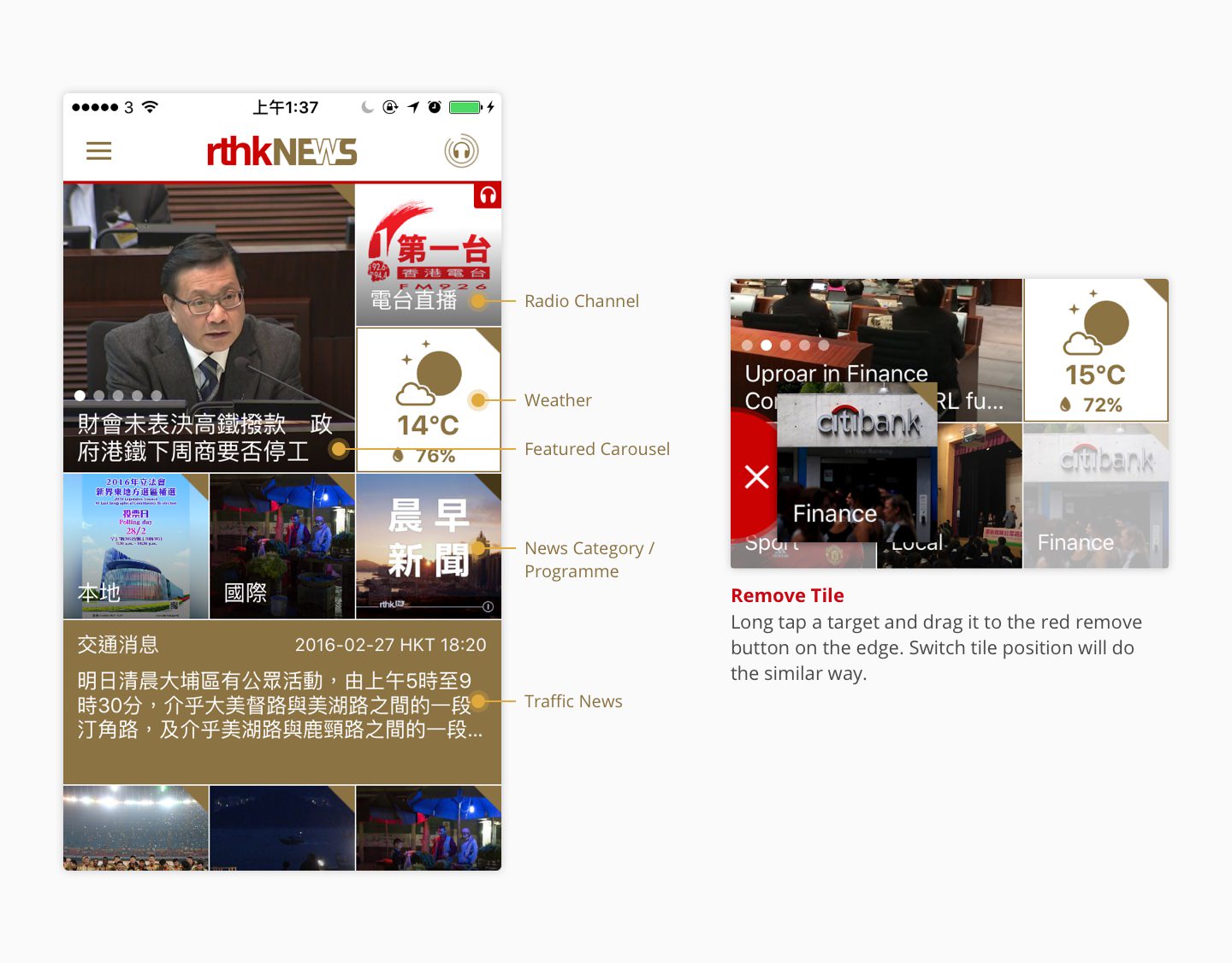
Multimedia Mode: News Dashboard
The multimedia mode allows users to:
- Browse multimedia content
- Pin news tiles to the dashboard for quick access to news, articles, podcasts or radio channels
- View live information, such as weather and traffic news, at a glance
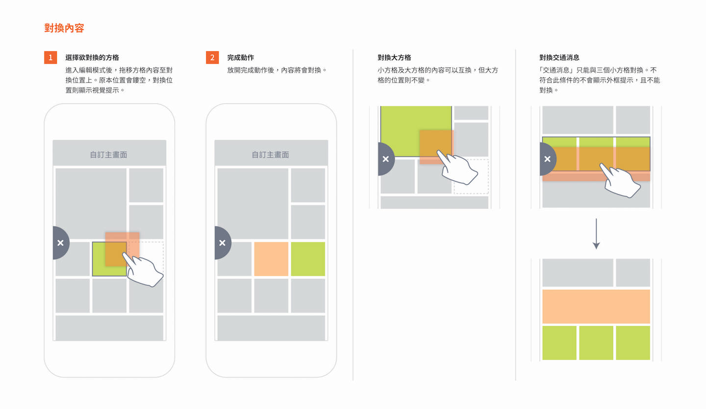
- Rearrange, add or remove news tiles with a drag and drop interface
Design Guidelines
- Interactive transitions
- Filling up empty spaces with tiles
- Ensuring a consistent and intuitive user experience
Simple Mode: Universal Design for Accessibility
The simple mode is designed for low-vision users and those with limited data. It aims to meet the WCAG 2.0, Level AA.
Linear Layout: Streamlined Navigation
Low-vision users often take longer to make decisions while navigating the app. Presenting information linearly helps users understand the app’s flow and anticipate the result of their actions.
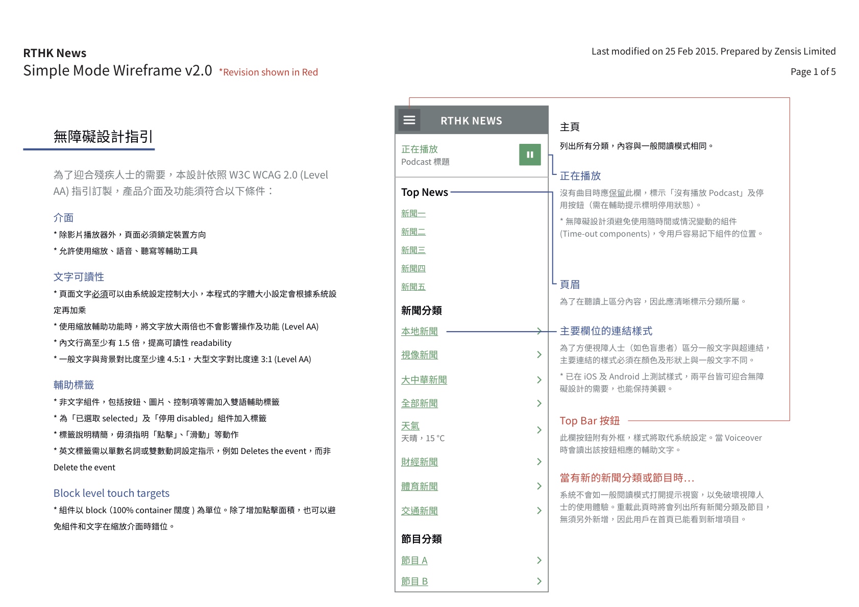
Visibility and States: Consistent Action Buttons
Hiding elements that are not useful or in their current state can be problematic for low-vision users. Primary action buttons should remain consistent in size and position, making it easier for users to learn the app and remember the placement.

Afterword: Striking a Balance
The two viewing modes cater to different user groups while maintaining a universally accessible design. Through careful balance, the platform ensures that both normal vision and vision-impaired users can navigate and understand the app effectively.
This case study demonstrates the importance of considering both accessibility and usability in UI/UX design, creating an intuitive experience for all users.
More UI designs on Behance.
| Client | Radio Television Hong Kong |
|---|---|
| Role | Design Lead (Zensis): UX & UI |
| Platform | iOS and Android Universal Apps |
