
HKTE Education’s Whiteboard is a flipped learning app designed to assist teachers in creating and sharing tutorials, quizzes and interactive content with their students.
Overview
After completing the HKTE Flipped app in August 2015, our team began working on its companion, Whiteboard. Our goal was to improve the content creation and uploading experience by providing an intuitive interface that accommodates users with various technical backgrounds.

Target Users
- Local secondary school teachers
- Teaching assistants
User Goals
- Prepare and share tutorials.
- Create and upload content intuitively with minimal clicks.
- Complete specific objectives on each page.
- Accessible to users with low-tech backgrounds.
Design Process
Canvas: Tool Selection
To create video tutorials, users record drawings and voiceovers on the canvas. We aimed to provide a natural, intuitive experience that aligns with users’ app usage habits.
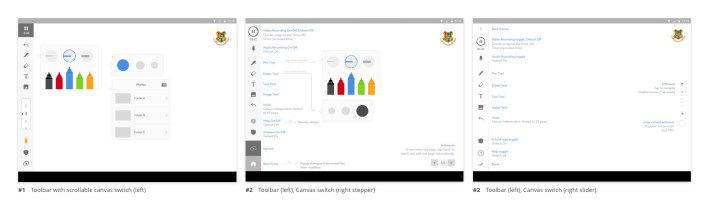
Proposed Design: Sidebar Approach
During the wireframing stage, we proposed a side toolbar similar to applications like Photoshop, Bamboo Paper and Paper by FiftyThree:
- Extended drawing space on a landscape screen.
- Convenient for right-handed users to draw with the right hand and switch tools with the left hand.
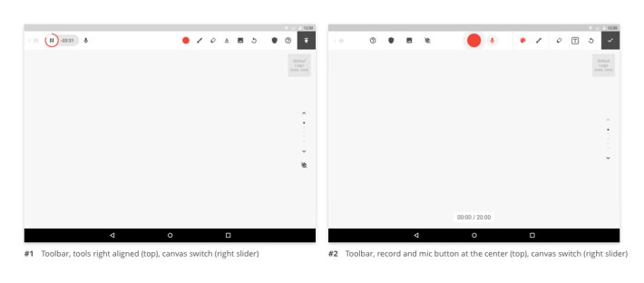
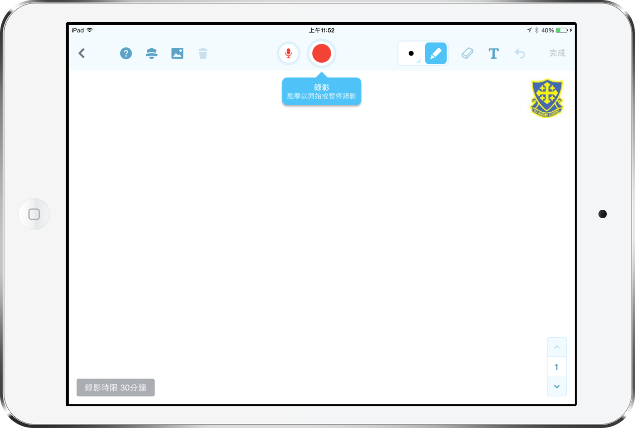
Final Design: Top Bar Approach
After discussion with the client, we decided on the top bar approach, which offers:
- More functions on the top bar.
- Familiarity, as users are more accustomed to top bars than sidebars.
- Prominence for action buttons (record and mic switch) by centring them.
Pen Panel: Intuitiveness and Familiarity
For usability, we grouped brush size and colour pickers as features of the pen tool, eliminating the need for users to switch between panels. We explored various options and ultimately chose a pop-up (solution D below) with a wide range of colours and a direct presentation of brush sizes.

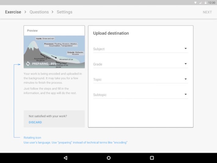
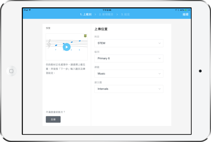
Uploads: Clear Objectives
We broke down the uploading process into three steps with breadcrumb navigation on top, allowing users to focus on each task and monitor their progress.
- Select the upload destination.
- Enter quiz questions.
- Configure settings.
Uploads Tray: Delightful Transition
To enhance the user experience, we implemented significant transitions and animation that make the waiting process appear shorter and smoother. The uploads tray displays items that have not been uploaded or failed. As this situation is uncommon, we created a simple transition that only appears when triggered, without occupying persistent screen space.
The prototype is animated with Form.
Product Screenshots


App Icon Design
Although the product lacked a branding guideline, we incorporated the requested elements: recording, learning (or education), and the tablet. We emphasised the recording aspect, de-emphasised the tablet and created several design variants.
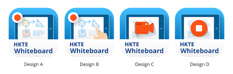
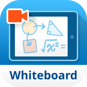
We ultimately chose a design featuring a camcorder and replaced dummy text with a mathematical expression to convey the app’s purpose.
| Client | HKT Education |
|---|---|
| Role | Design Lead (Zensis): wireframing, prototyping, UX & UI, app icon design |
| Platform | iOS & Android tablet apps |
