
Coco Coffee House, a women-only social platform built by Women In Work, an organisation that runs in-person networking events. Members carried 4 paper vouchers each month to attend events. They forgot them. Staff spent time tracking quotas instead of hosting. And the in-app matching showed profiles without any shared context, so most connections stalled before they started.
I embedded myself in the community as the freelance designer. I redesigned the core experience from paper-based loyalty to a digital stamp card, a context-driven matching flow, a subscription transition strategy, and a full brand refresh.
The Problem
Women In Work had built a real community offline. The app was meant to extend that into a daily digital space. But two gaps kept it from working:
- Physical-digital disconnect: Members loved the events, but had to carry physical vouchers. Each month, they got 4 vouchers/paper stamps. Forgetting them meant being turned away. Staff also spent event time manually tracking quotas.
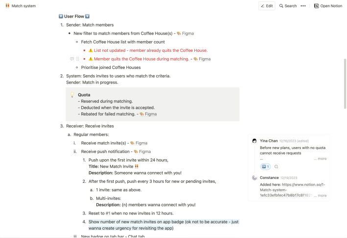
- Contextless matching: The matching feature showed member profiles without shared interests or activities. With no conversation starter, leading to stalled connections.
On top of this, the founding team had limited product experience. Requirements shifted week to week. Releases were ad hoc. This design work had to account for that instability.
Research Approach
I spent time in the community to understand how people actually used the app.
Participatory Observations
- Attended two offline events to watch how members used the app in person.
- Joined the in-app group chat to track organic feedback and complaints over several weeks.


Stakeholder Interviews
- Talked to both co-founders about member behaviour, company values and what they had heard from members.
- Reviewed the member feedback they had already collected.
Design Process
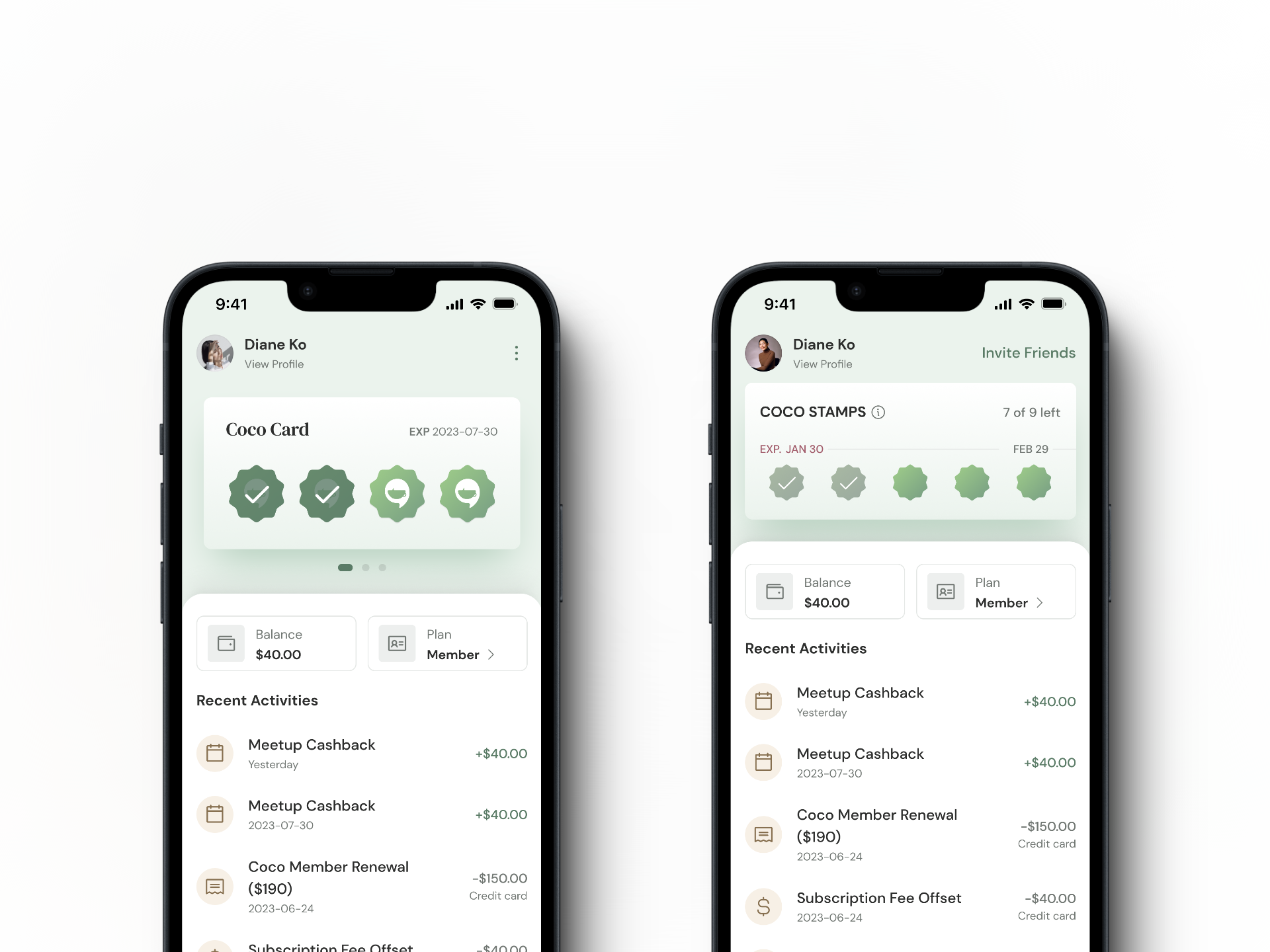
Digital Stamp Card
The paper voucher system had a clear replacement: keep the mental model, remove the paper.
I designed a digital stamp card that mirrored the paper experience but added capabilities that paper couldn’t support:
- View attendance history and remaining stamps (quota) at a glance
- Top up beyond the monthly limit when members want more events
- See expiry dates without counting manually
Members already understood how stamp cards worked. The digital version removed the physical friction without asking them to learn a new interaction.
Humanising the Matching Experience
The client already had a clear vision for how matching should work — the system would pair members based on shared interests and group activities, rather than asking users to browse and choose. My role was to design an interface that made that logic feel natural and trustworthy:
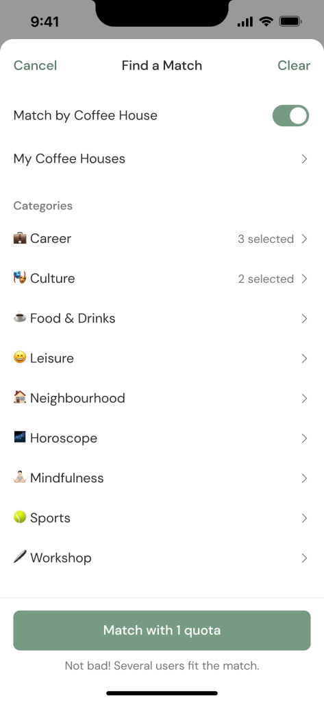
Matches based on shared interests and group participation.
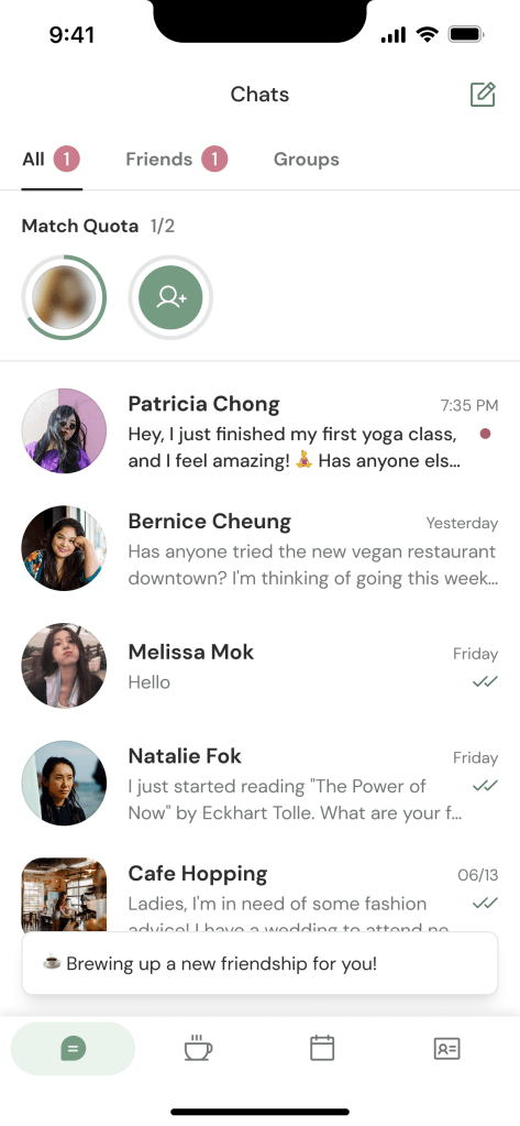
Moving matching into the Chats tab reduced context-switching.
A story-like progression with circular indicators and hidden profile photos to build curiosity.
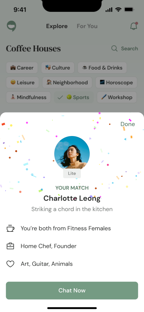
Confetti and a highlight of common interests created a small celebration at the match.
The interaction design focused on trust. Progressive disclosure meant members saw just enough information at each step to feel comfortable moving forward.
Subscription Transition Strategy
Coco planned to move from free access to a subscription model. This is a delicate transition for any community product, especially one built on trust and belonging. I designed the communication and UX strategy:
How to upsell subscription without alienating the existing community?
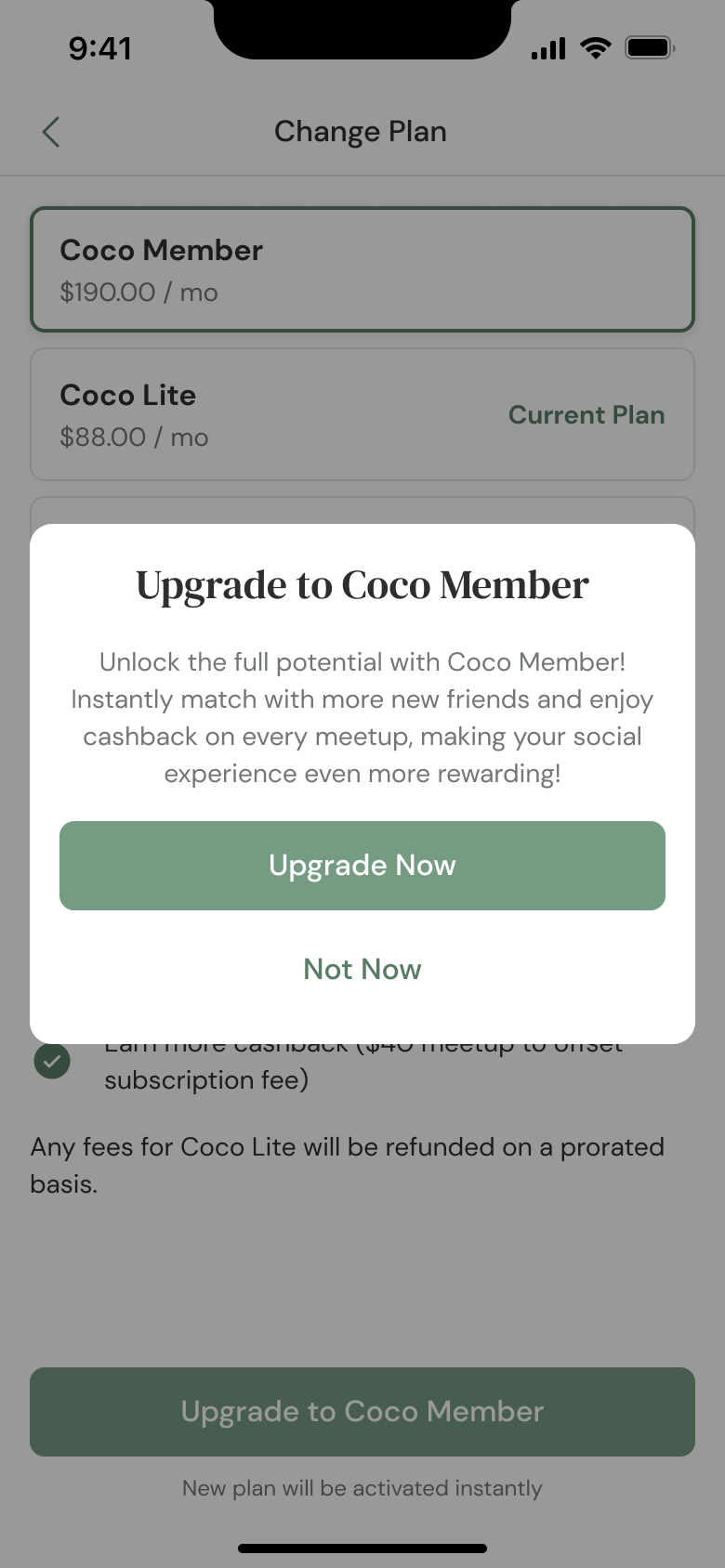
Framed the subscription as “unlocking more connections” rather than “paywalling existing features”
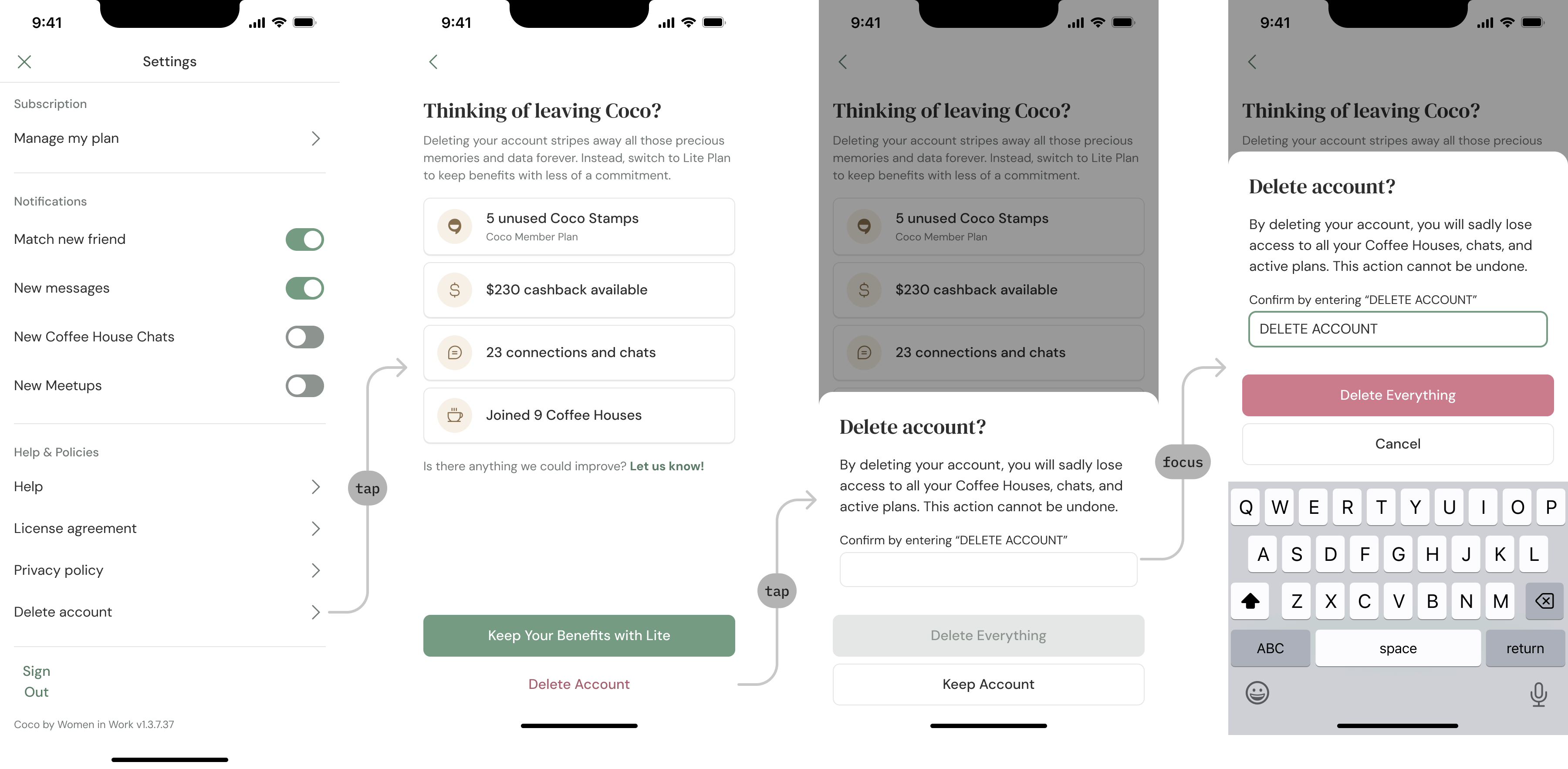
- Designed a downgrade path that was more visible than account deletion, reducing the chance of permanent churn.
- Added a feedback form when users attempted to delete their accounts, turning exit attempts into product insights.
I handed off the designs before the subscription launched and was not involved in post-launch analytics. The strategy and UI were implemented, but I don’t have data on how they performed.
Brand Refresh
The original brand felt transactional; it didn’t match the warmth of the in-person community.
Updates:
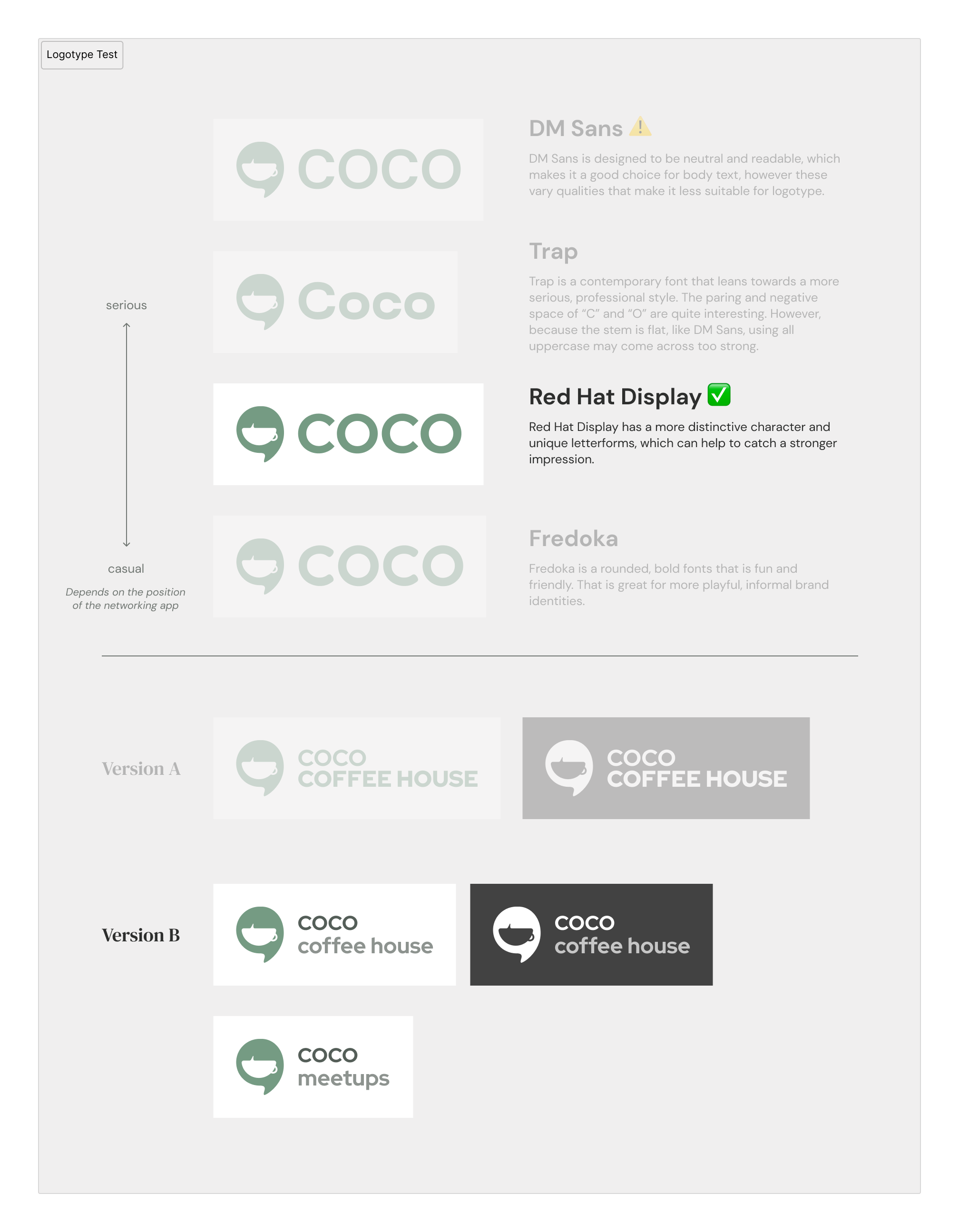
- Logo: Created logo lockups paired with a new logotype
- Colour: Shifted to a soft green palette. WCAG AA compliant, but more importantly, it carried the “coffee house” feeling.
- Typography: Elegant sans-serif for body text, serif for headings. Approachable but not casual.
- Illustrations: I used Recraft to generate initial illustration concepts in the direction I wanted, then vectorised and adjusted each asset by hand in Illustrator. Soft greenery motifs reinforced the idea of an organic, growing community.
Constraints & Collaboration
Working with a startup meant the design work extended beyond screens.
- Clarifying Requirements
The team had ideas but limited product experience. I facilitated discussions to clarify each page’s core purpose, whether feature requests matched user needs and technical reality, and where to make trade-offs. - Supporting Implementation
During handoff, I provided implementation guidance alongside design specs — component library references, technical recommendations, and phasing strategies when the scope exceeded what the single developer could ship in one cycle. - Establishing Documentation
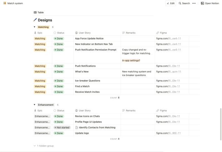
The team had no product documentation before I joined. I set up a Notion workspace with feature requirements, a tracking board for what was in progress and what was blocked, and edge case documentation to reduce back-and-forth during development.
What I Learned
- Familiar patterns reduce friction. The stamp card metaphor worked because members already understood the mental model. Meeting users where they are is more effective than inventing new interactions.
- Anticipation is part of the experience. The small celebrations — confetti on match, visible expiry dates, remaining stamp counts — kept engagement feeling natural. These details don’t need to be complex to matter.
- Establishing documentation. When a team has no product documentation, and the developer is the only person building, establishing communication practices and shared references is as valuable as any screen design.
Outcomes
I left the project after the core designs shipped, before the subscription model launched. I attended the launch party and stayed in touch with the team.
- Members reported that the digital stamp card eliminated the forgotten-vouchers problem entirely.
- Members at the launch party said that the new matching felt “more thoughtful” and made it easier to start conversations.
- The component patterns I created were reused across subsequent features.
While my involvement ended, the redesign addressed the core friction points and brought Coco closer to its mission of safety and connection.
| My Role | Freelance Product Designer (with PM & technical strategy responsibilities) |
| Team | 2 co-founders, 1 developer |
| Responsibilities | Product strategy, UI/UX Design (iOS and Android), brand refresh & visual identity, PRD documentation & requirements clarification |
Need a design strategist to create user-friendly solutions? Let’s connect!
