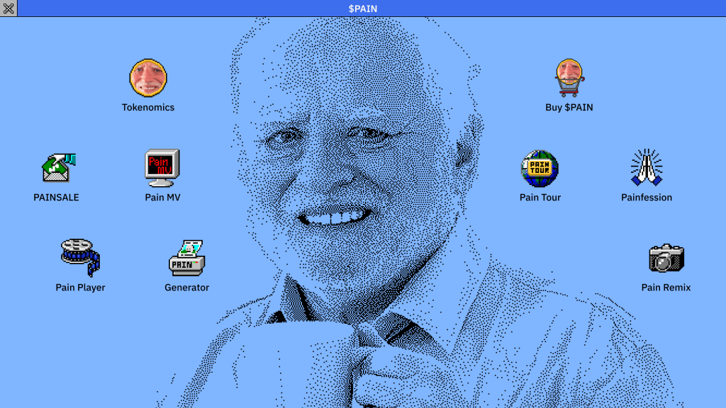
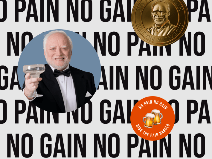
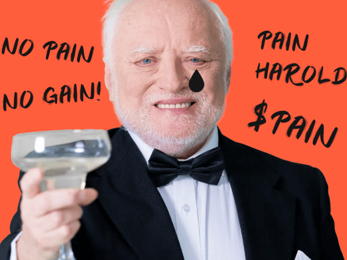
Hide the Pain Harold isn’t just a meme. He’s a real person — a retired Hungarian engineer whose photo became one of the most recognised memes on the internet. When we set out to build the official $PAIN meme coin*, an 8-bit pixel aesthetic didn’t make sense. Harold would have used Windows 3.0 in his early career, so we built a fully interactive Windows 3.x desktop.
The site raised 185,976 $SOL in 48 hours, setting the record for meme coin presales at the time.
*Meme coins are cryptocurrencies inspired by internet memes. They run on community hype, rather than traditional utility.
Key Highlights:
- 🚀 185,976 $SOL raised in 48 hours (highest meme coin presales on record)
- 🎨 Fully interactive Windows 3.0 interface with draggable windows and easter eggs.
- 👥 Led design alongside Head of Product, PM and engineering team
- ⏱️ 6 months of work, shipped Feburary 2025
The Context
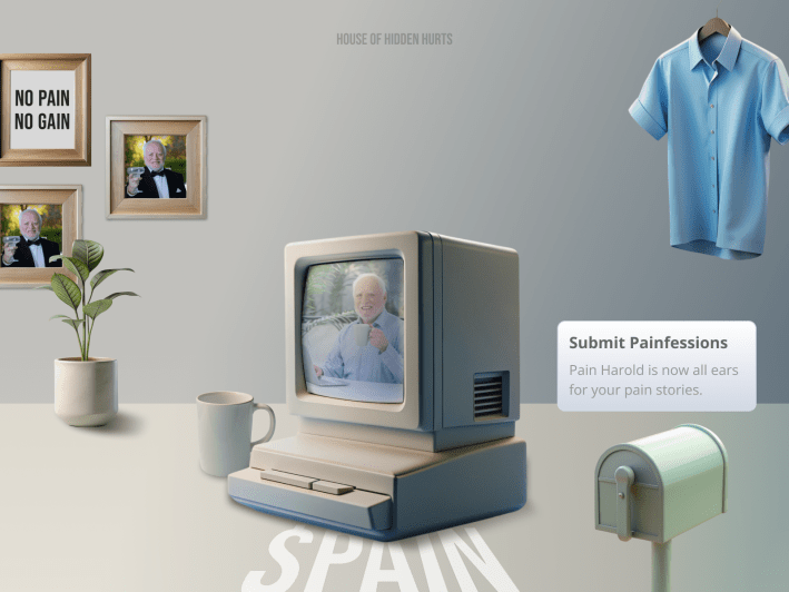
Every meme coin website in 2024 looked the same. 8-bit pixel art, generic Web 1.0 styling, interchangeable mascots. $PAIN needed to stand out visually while staying true to Harold’s “enduring pain” vibe, a retired professional who became famous for looking politely uncomfortable.
The core question:
How do we build presale hype? How do we get crypto speculators and meme culture enthusiasts to actually care?
In the meme coin space, visual impact drives social shares. No “wow” factor means getting ignored.
The timeline pressure: We had about six months to build everything, until a surprise 48-hour deadline for the presale airdrop forced us to pivot dramatically.
Design Process
Design from Character
I believed that meme coin communities buy into a character, not a template. The strongest signal we could send was an interface that felt like it belonged to Harold — something he would have actually used.
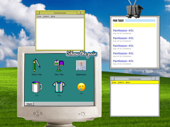
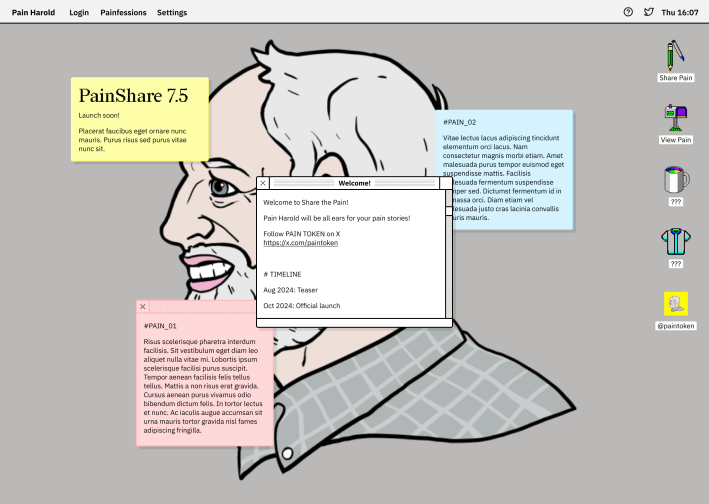
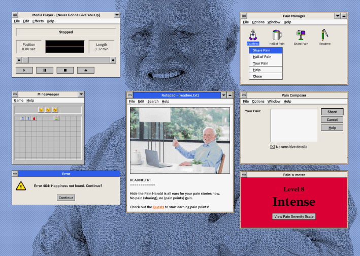
Windows 3.0 was the obvious choice, but not for retro novelty. It was the OS Harold would have worked with during his professional career. It also gave us a natural structure for features: every function became a draggable window on the desktop.

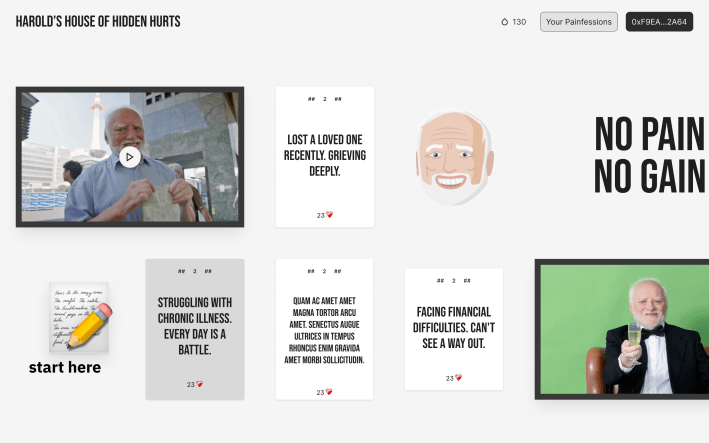
We explored several directions before landing here. A Stickies × 90s Retro approach was strong for the social sharing feature (we called it Painfession), but it couldn’t house all the features in one coherent metaphor. The desktop could.
The chosen direction:
So we built a fully functional Windows 3.x desktop interface. Every feature lived in its own draggable window.
Narrative Naming: Feature as Apps
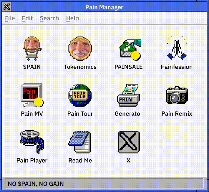
Worked with the Head of Product to turn functional labels into narrative concepts. A menu became Pain Manager. The meme generator became Pain Generator. The About section became Read Me. Each name reinforced that you were inside Harold’s computer.
| Function | Traditional Label | Our Name |
|---|---|---|
| Navigation Menu | Menu | Pain Manager |
| Meme Generator | Generator | Pain Generator |
| Music Video | Video | Pain MV |
| Photo Gallery | Gallery | Pain Tour |
| Video Clips | Videos | Pain Player |
| Introduction | About | Read Me |
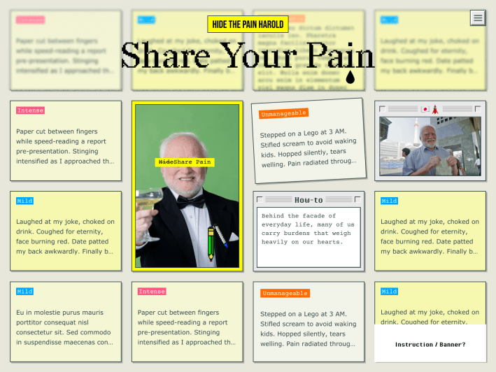
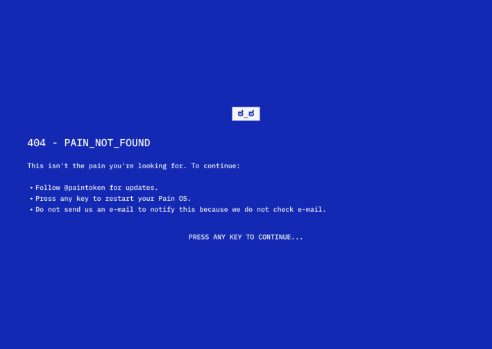
The “New Ugly” Moment
*New Ugly means rejecting traditional perfection, using “distasteful” elements to make a visual statement.
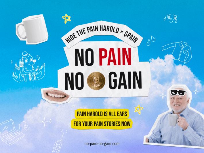
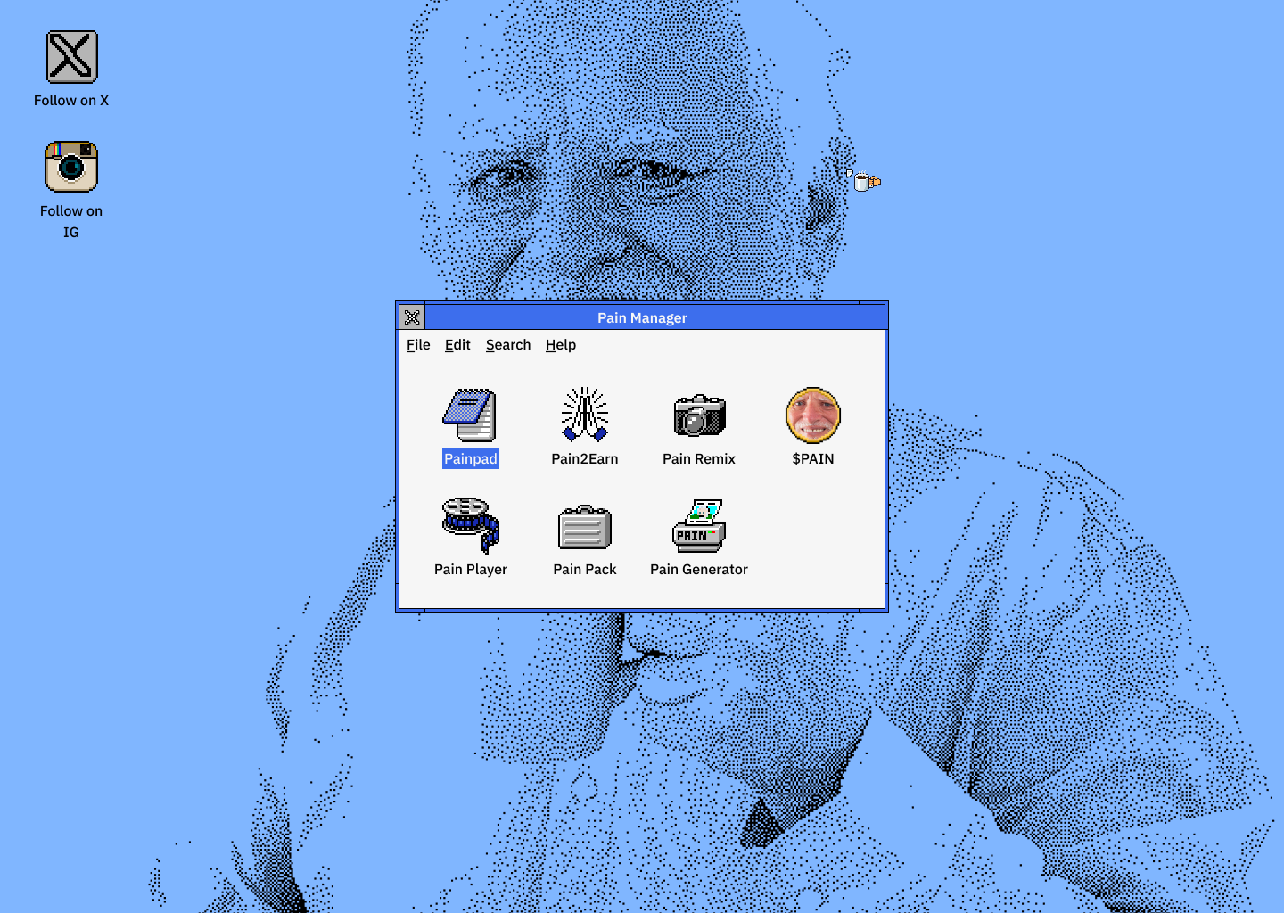
After pre-launch, the team swapped my subtle blue background for a repeating pattern of Harold’s face to maximise visual impact. I hated it at first—it looked wrong.
I didn’t revert it. Instead, I watched the community. People were sharing screenshots of the interface. The visual density — Harold’s face tiled across the screen — had a chaotic energy that resonated with meme coin audiences. They didn’t want a clean, tasteful design. They wanted something so visually loud that they had to share it.
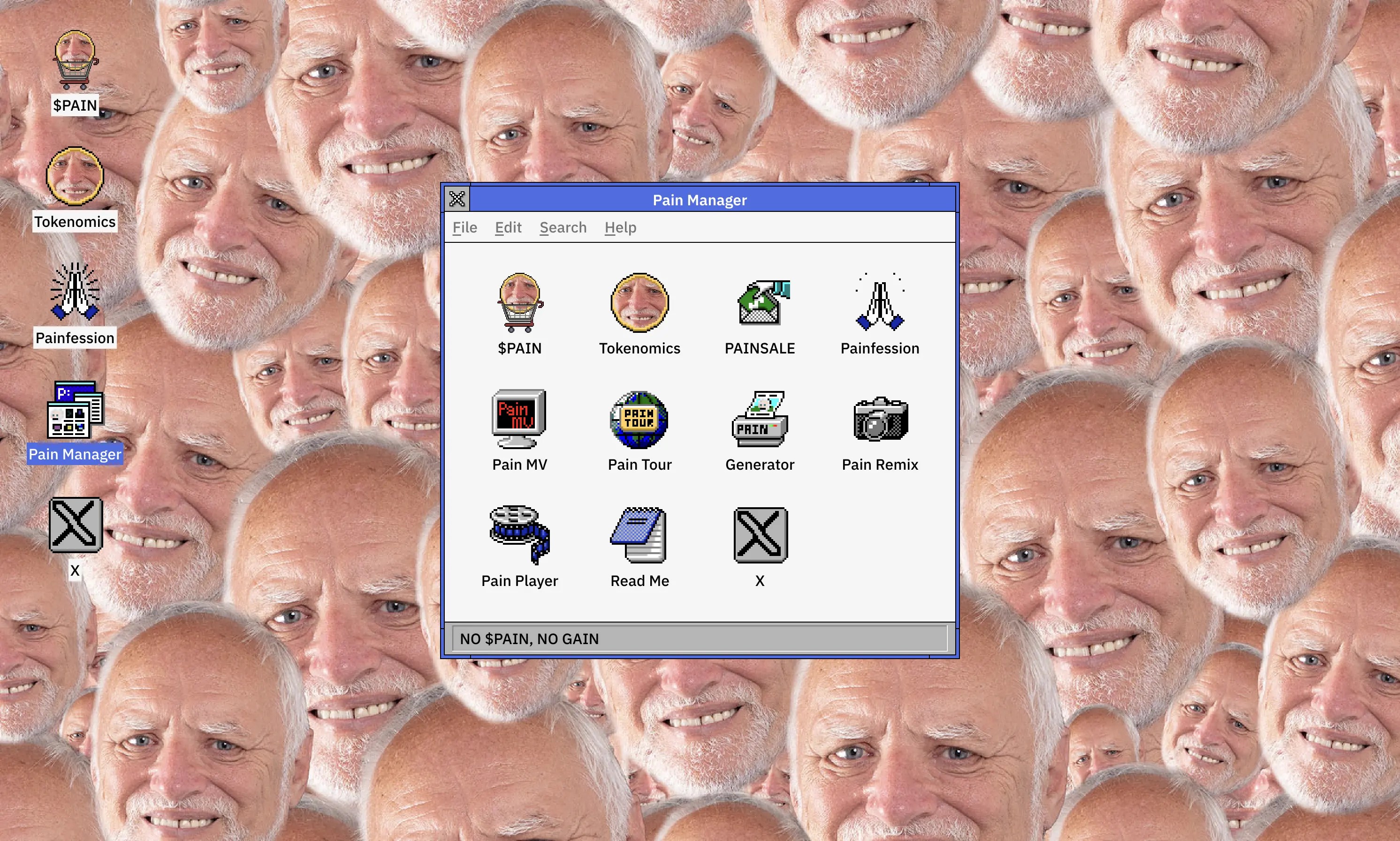
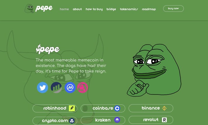
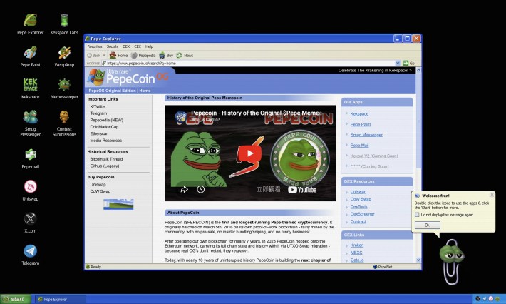
PepeCoin later launched a Windows XP-style interface. That validated the OS approach, but the New Ugly moment was the real lesson: in this context, shareability beats taste.
Constraints & Collaboration
The 48-Hour Pivot
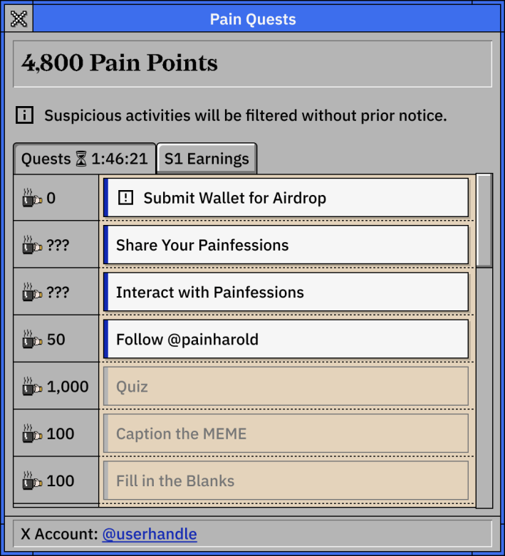
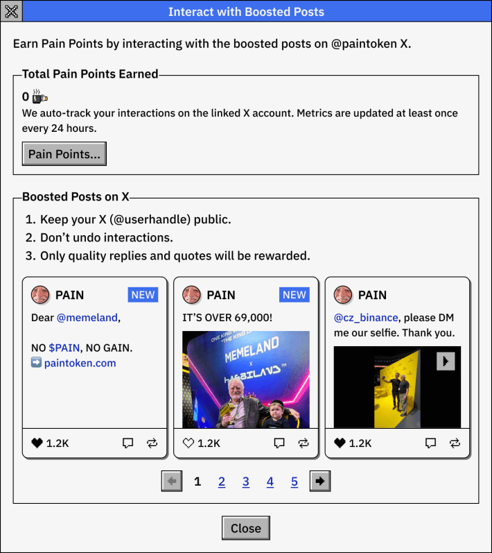
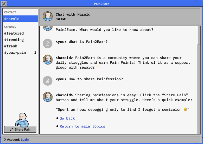
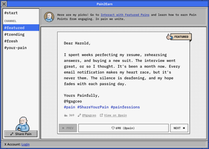
We spent months building two major features: Pain Quests let users farm points by completing tasks. Painfession was a social feed where people shared their own “pain” stories.
Then we got 48 hours’ notice for the presale airdrop.
Everything changed. Painfession submissions got redirected to a basic web form and a hashtag feed on X. Pain Quests was cut entirely. The site kept only the features that fit inside the desktop metaphor — the media player, the photo gallery, the meme generator, etc.
I didn’t fight the cuts. There wasn’t time. My job shifted to making sure the remaining flow held together — that someone landing on the desktop could still understand what to do and where to click.
Features built but couldn’t be launched:
Working with Everyone
- Head of Product: Translated concepts into narrative experiences
- PM: Nailing down requirements for complex flows
- Designer: Delegated features while checking quality
- CEO: Adapted to direct design feedback, making sure implementation matched intent
I also set the art direction and built social media templates, OG images and meta tags for consistency across channels.
The Solution
The final $PAIN site was a fully interactive Windows 3.x desktop (with a mobile version too). Users could drag windows around, mess with pixelated graphics and hunt for easter eggs.
The UI wasn’t just decoration. It was the story.
Impact
- Record-breaking presale: 185,976 $SOL raised in 48 hours. The highest meme coin presale at the time.
- Business: This established Stakeland’s credibility in web3 and led to implementation, marketing and consulting opportunities.
- Web experience: The Windows 3.0 design carried the experience even after we cut most of the functionality. People remembered the interface and recognised Harold in it. The site got shared on its own terms, not just as a link to a token sale. PepeCoin’s later Windows XP interface proved we were onto something.
What I took away
Scope resilience
The 48-hour pivot taught me something about scope. In crypto, stripping a product to its essence under extreme time pressure isn’t just a design skill — it’s a survival skill. The Windows 3.x metaphor was flexible enough to absorb major cuts and still feel intentional.
The core learning
The New Ugly moment taught me something harder. “Good design” judgment depends on context. What I thought was a mistake was the right call for this audience. Being a good designer in a new space means knowing when your taste isn’t the target.
| Role | UI/UX Design Lead at Memeland/9GAG |
| Team | Head of Product, 1 PM, 4 engineers, 2 designers (including me), 1 artist, 1 QA, marketing team |
| Time | ~6 months, pre-launch in Feb 2025 |
| Website | paintoken.com |
