
Jobable was losing ground in Hong Kong’s competitive job board market. Despite having quality job listings, the platform suffered from high bounce rate and low page views.
The Challenges
The core problems were clear:
- Generic experience: The design felt like a template, failing to resonate with local job seekers who expected culturally-relevant job discovery.
- Search friction: A single, limited search field forced users to know exactly what they were looking for, creating barriers for exploratory job hunting.
- Fragmented information: Job details and company information were disconnected, forcing candidates to piece together context during their evaluation.
- The stakes: Without intervention, Jobable risked becoming irrelevant as users migrated to international competitors that offered more sophisticated, localized experiences. The business needed a redesign that would not only improve usability but also strengthen local market positioning.
Research & Key Insights
We conducted research with Google Analytics and stakeholder interviews with the commercial team.
Insight 1: Two Distinct User Segments
Google Analytics revealed two core user groups with different needs:
- Young professionals (25–34): 4-6 years experience, targeting large companies and transparent startup cultures.
- Students: Undergraduates and graduates seeking internships and summer jobs.
How this shaped the design:
Instead of a one-size-fits-all search, we created segmented entry points—dedicated pathways for startup jobs, government positions and internships directly on the landing page. This reduced the cognitive load by surfacing relevant categories upfront rather than forcing users to search blindly.
Insight 2: The Discovery Gap
User behaviour data showed candidates frequently navigated to internal job listings after reading a job description, suggesting they lacked sufficient company context during initial evaluation.
How this shaped the design:
We restructured the job description layout to surface key information (skills, requirements) upfront while creating comprehensive company pages that included culture, work environment, dress code, and location details, reducing the need for users to leave the platform for research.
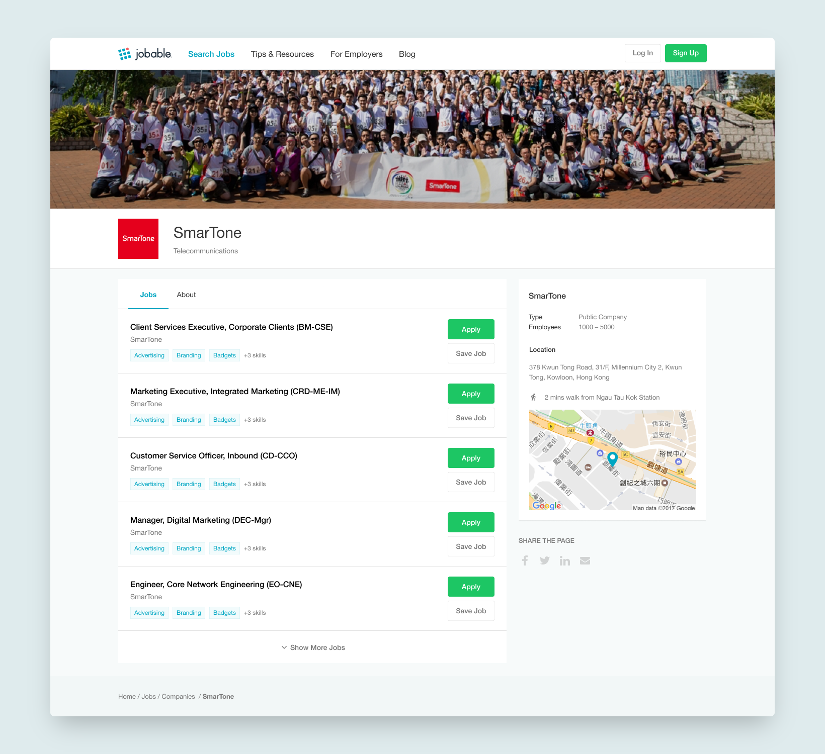
Companies Job Boards
Having limited online job boards can make it harder for job seekers to find out about all the current job openings available.
How this shaped the design:
We created individual company pages that work like company job boards.
Design Strategy
We have been working hard on redesigning and developing a new marketing strategy based on page views and bounce rate.
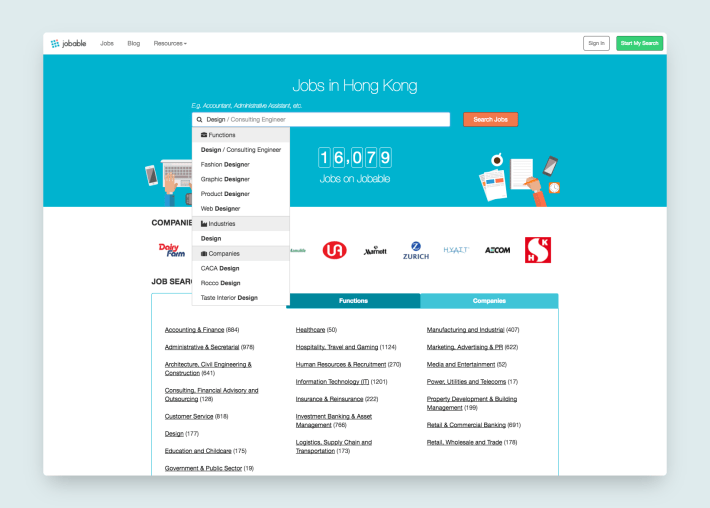
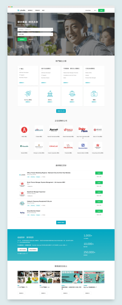
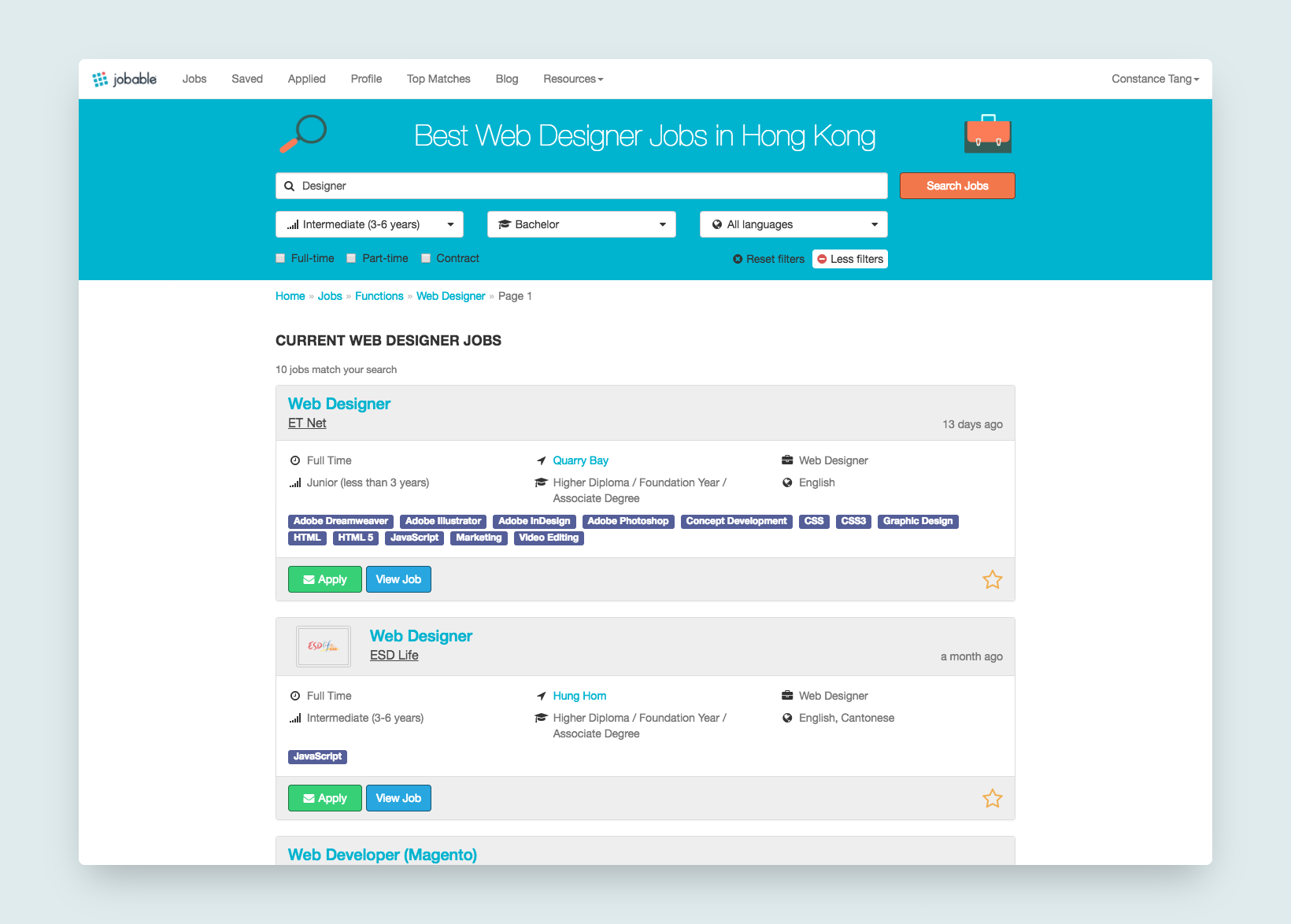
1.1 Reducing Search Friction
Before: A single search field with inconsistent auto-suggestions forced users to guess at effective keywords.
After: A categorised search system
- Categorised inputs: Improved the search experience by categorising common search inputs and incorporating drop-down menus for quicker navigation.
- Visual hierarchy: Relocated sign-up/login below the search bar to prioritise the primary task.
- Localised hero section: Real photography of Hong Kong professionals with translated taglines. Some supporting copies may include dialects like “搵工”.
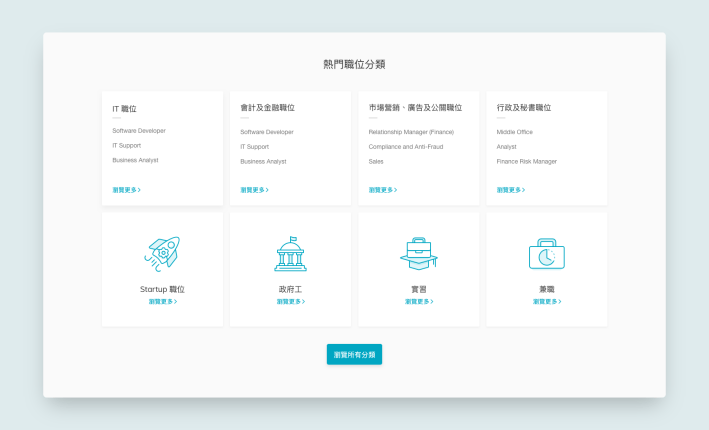
1.2 Supporting Exploratory Discovery
Problem: Users didn’t always know what to search for, especially students exploring options.
Solution: Curated category cards on the landing page
- Featured startup jobs, government jobs and internships based on historical data on popular categories
- Each card served as both a filter and an education tool, showcasing Jobable’s unique marketplace position
1.3 Introduction and Call-to-action
The call-to-action area has three main purposes:
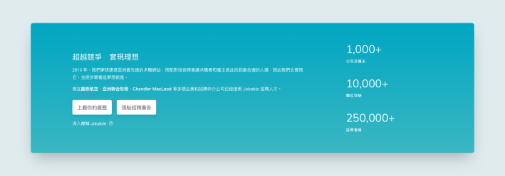
Establish a professional and credible image. Initially, the number of job vacancies was shown in the hero section above the fold. However, as it was not essential for searching, I moved it down along with the number of employers and members.
The other two purposes are for commercial use, allowing job seekers and employers to upload resumes or post job advertisements after familiarising themselves with Jobable.
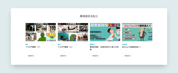
1.4 Keeping the Website Fresh
In addition to job listings, we included time-sensitive information to educate job seekers about the industry and promote the platform.
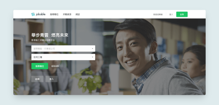
1.5 The New Landing
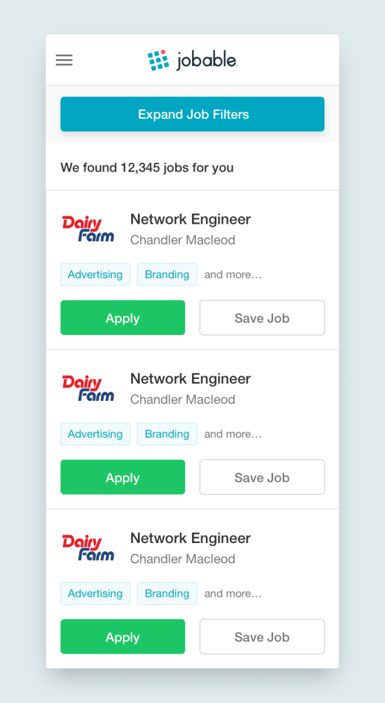
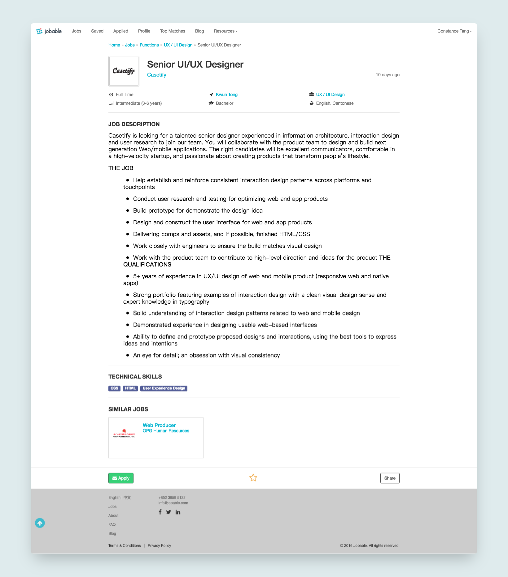
2. Search Result Page Clean-ups
Users can select a result and update search criteria on a search results page.
The search result page was designed to display more results upfront and enhance the search functionality. By expanding the searchable data fields, we aimed to create a more robust and user-friendly search experience.
Implementing a permanent top search bar may not always be the most optimal choice when offering multiple search options, exceeding three. Considering a side search layout, similar to Amazon, can streamline the search process. This layout eliminates redundant information from the results, resulting in a more concise presentation with a higher data-ink ratio. It also emphasises the skill tags and application buttons while creating space to showcase additional results.
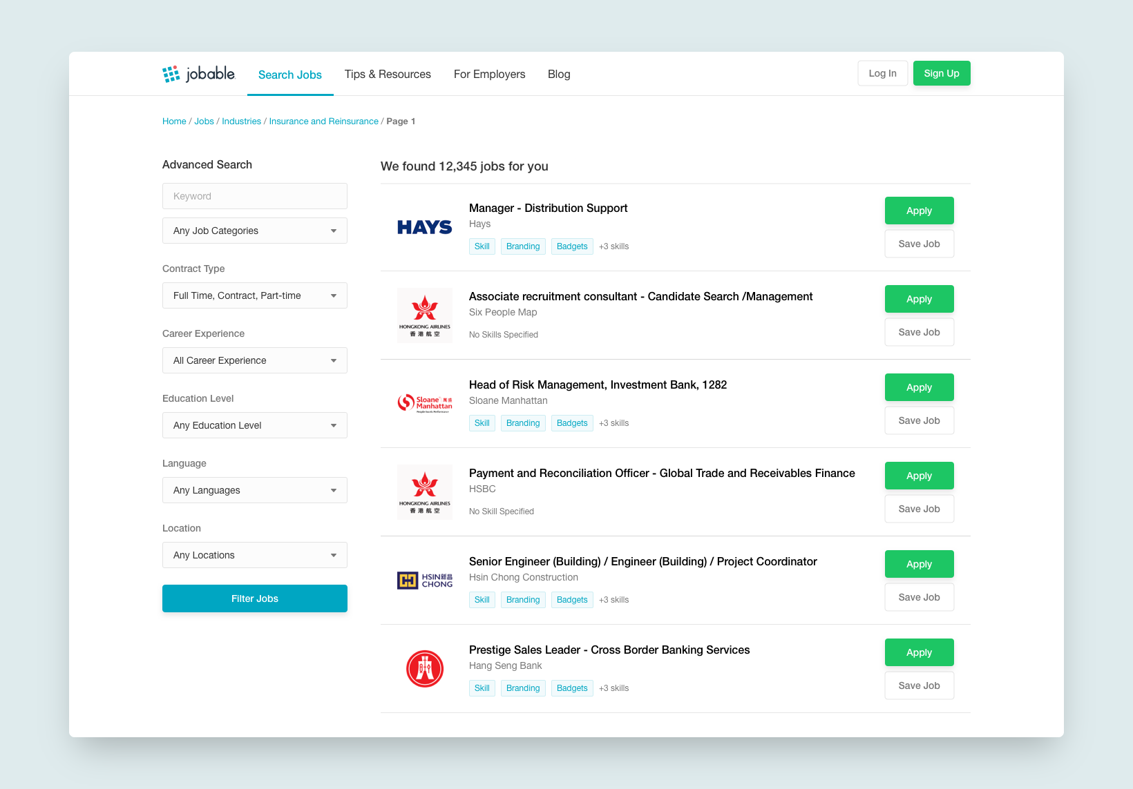
To optimise mobile page functionality, the new search area is collapsible to prioritise search results.
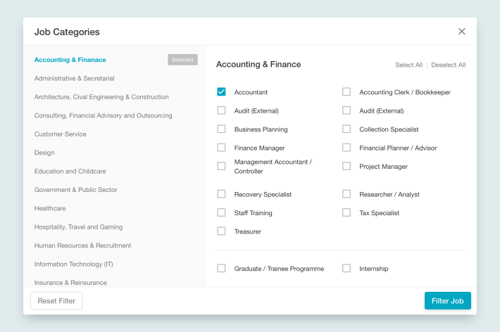
Job seekers explore different categories. If a specific category is not found, they can select from related categories via a pop-up modal.
3. Balancing Information Density
Problem: The original job description pages were cluttered and company information was fragmented across multiple pages.
Solution: Reorganised information architecture
- Skills-first layout: Key requirements and skills surfaced at the top
- Sidebar company context: Essential company details visible alongside the job description
- Summary table: Quick-reference section for salary, location and application deadlines
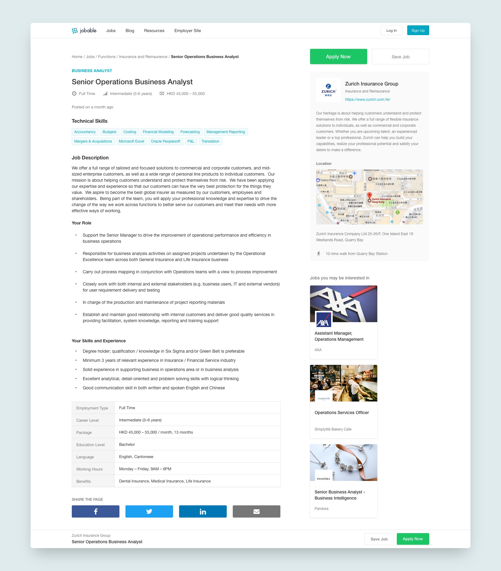
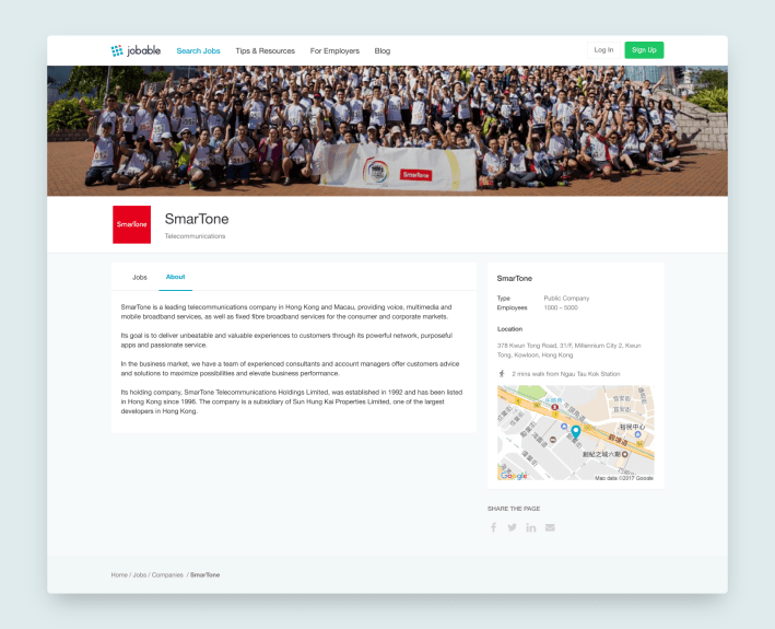
4. Elevating Company Presence
Problem: Company pages were minimal, missing an opportunity to differentiate Jobable and serve employer partners.
Local Expectations Insight
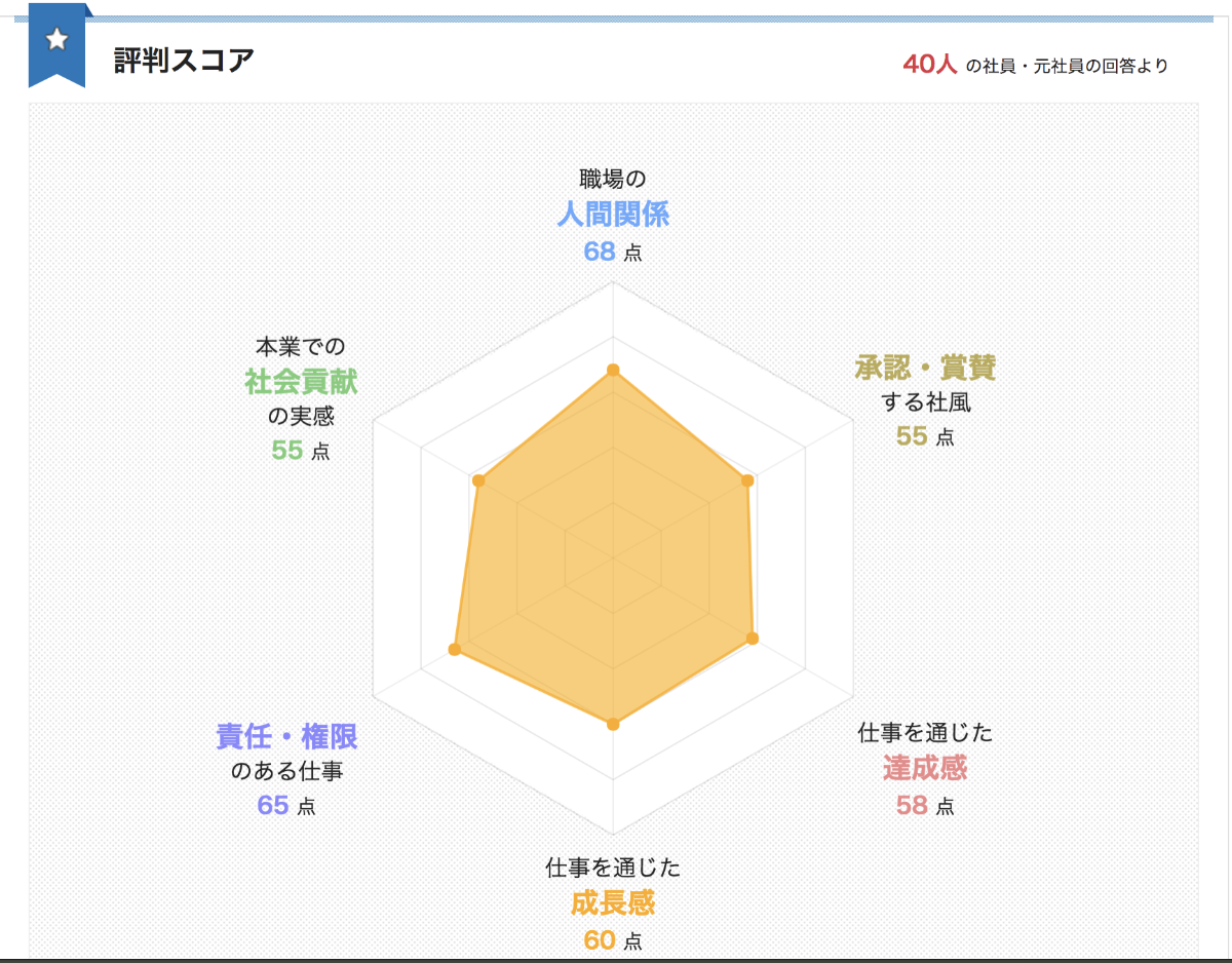
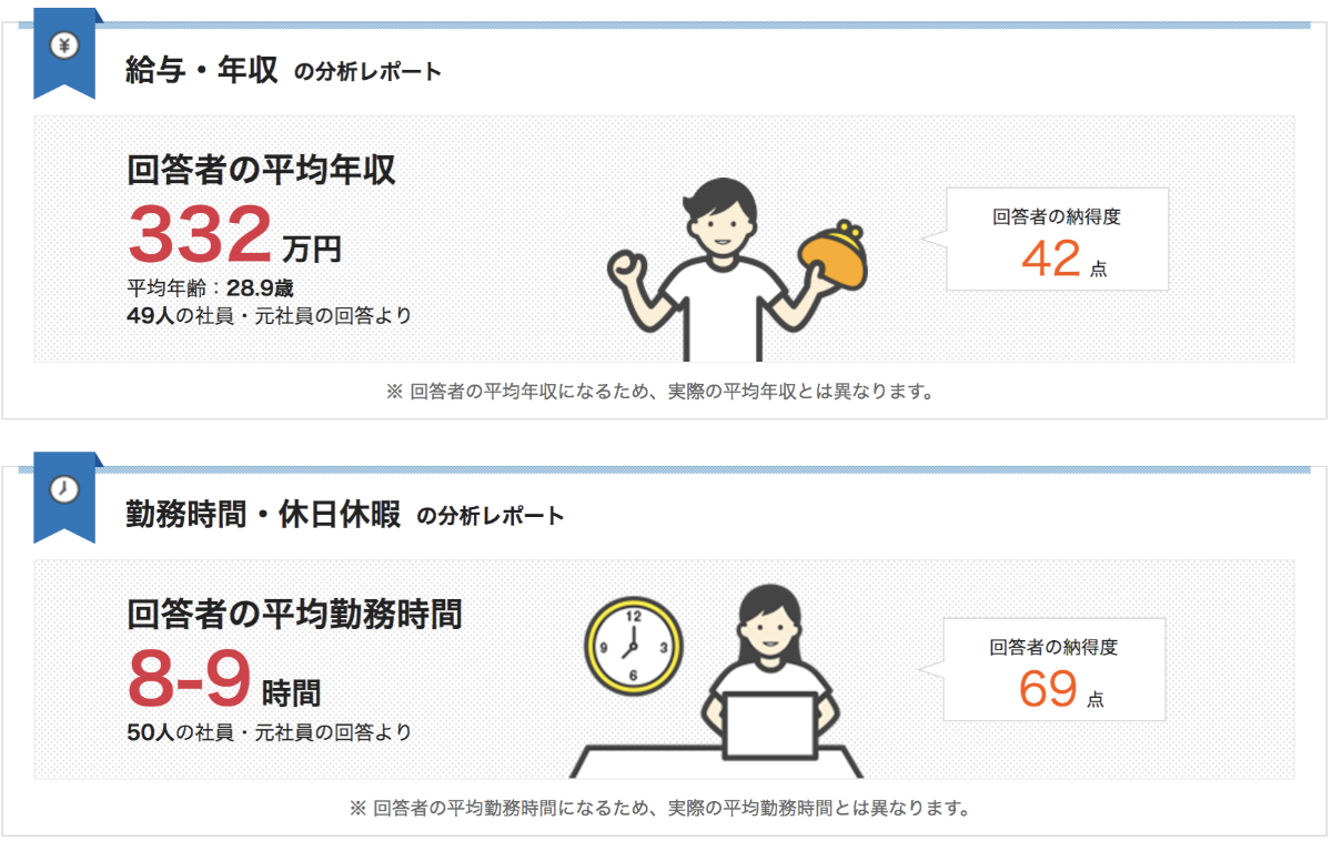
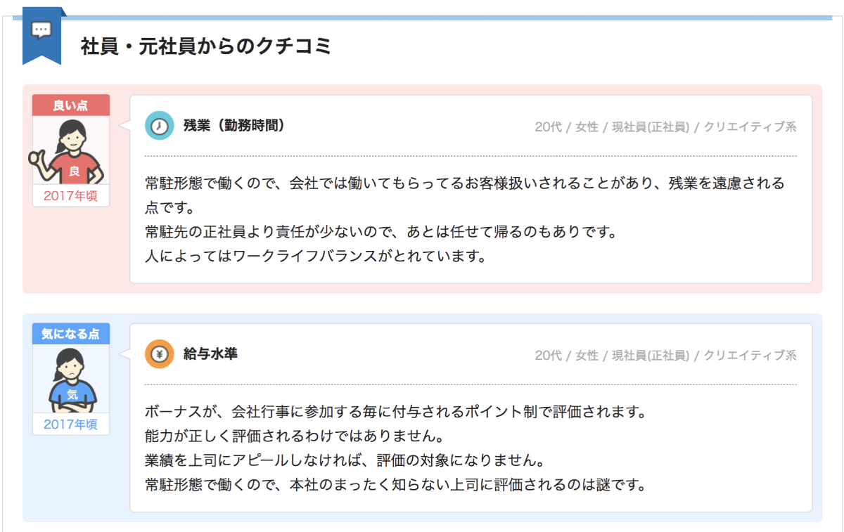
Competitive research on Asian job boards revealed that successful platforms (like those in Japan and China) offered rich company profiles including employee opinions and detailed workplace data—similar to Glassdoor’s model but adapted for local markets.
Solution: Comprehensive company profiles
I advocated for elevating the company page beyond a simple job listing container. The new design included company type, employee count, office location, metro proximity and culture highlights, positioning Jobable as a comprehensive career resource, not just a job board.
- Structured information: Company type, employee count, office location, metro proximity
- Culture highlights: Work environment, dress code, products/services
- White-label ready: Template designed for employer branding partnerships
This transformed the company page from a simple job listing container into a recruitment marketing tool, creating commercial value while serving job seeker needs. This initiative will also boost our SEO ranking and solidify our position as a market leader.
Reflections
Redesigning the whole platform has been quite an eye-opening journey for me. We had to let go of some initial ideas due to tech constraints and the need for more data, but it was a great chance to dive deeper into the product and craft a solid strategy, pitch, and design from a product angle. I got honest feedback from teammates along the way, and I really value their trust in me for such a big task.
Role
UX/UI design, product research, copywriting
Platform
Website
Timeline
Dec 2017
