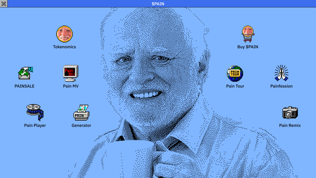
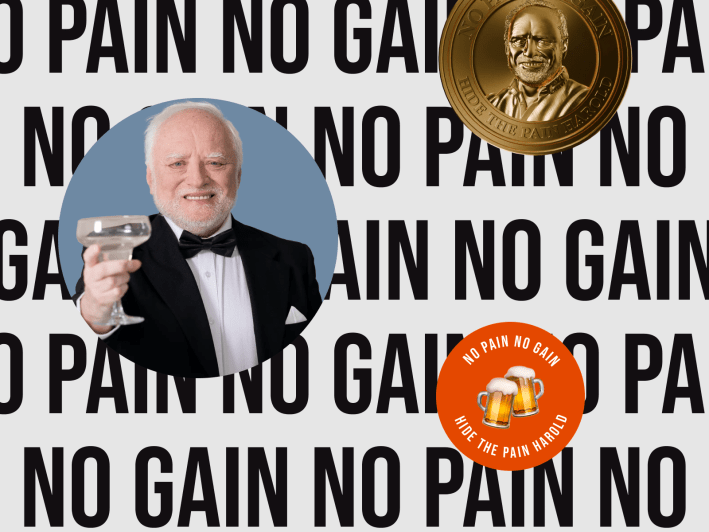
I led the design for $PAIN’s launch site, the official meme coin* of the iconic internet meme figure, Hide the Pain Harold. Instead of following the crowd with 8-bit pixel art, we built a Windows 3.0 interface. It worked.
*Meme coins are cryptocurrencies inspired by internet memes. They run on community hype, rather than traditional utility.
Key Highlights:
- 🚀 185,976 $SOL raised in 48 hours (record for meme coin presales at the time)
- 🎨 Created Windows 3.0 interface in meme coin space
- 👥 Led design team alongside our Head of Product, PM and engineers
- ⏱️ 6 months of work, launched Feb 2025
The Challenge
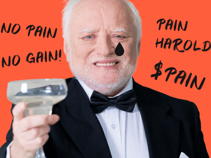
Every meme coin website looks the same. 8-bit pixel art everywhere. $PAIN needed to stand out visually while capturing Harold’s “enduring pain” vibe.
The core question:
How do we build hype for the pre-launch? How do we get crypto speculators and meme culture enthusiasts to actually care?
In the meme coin space, visual impact drives social shares. No “wow” factor means getting ignored.
The timeline pressure: We had about six months to build everything, until a surprise 48-hour deadline for the presale airdrop forced us to pivot dramatically.
Research & Insights
Most meme coin sites used ’90s web aesthetics, but not many of them went all-in on a specific OS interface.
The insight: Harold would have used Windows 3.x in his early career. Using the technology for his generation to present his meme coin just made sense.

Design Process
Art Direction Selection
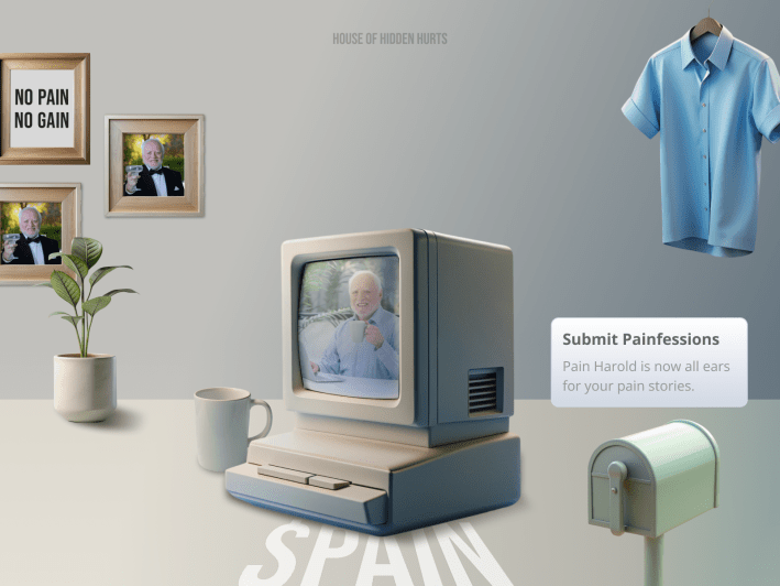
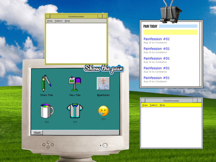
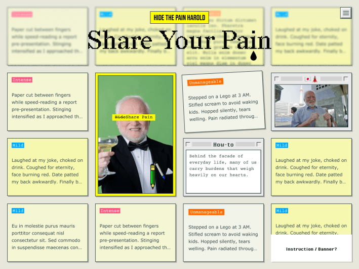
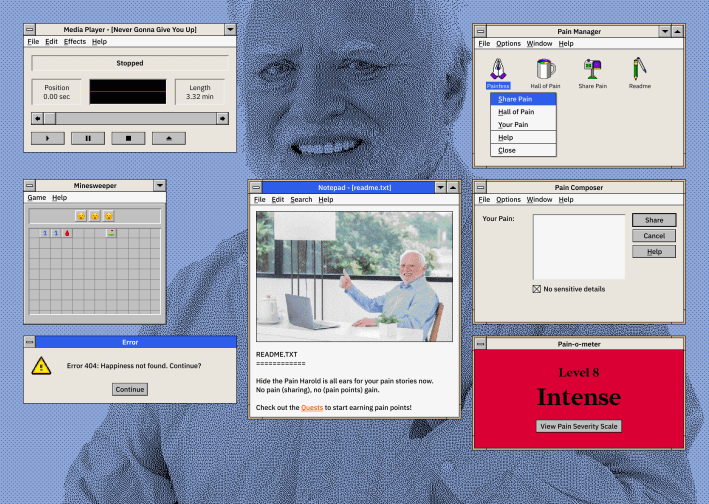
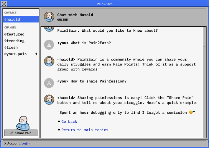
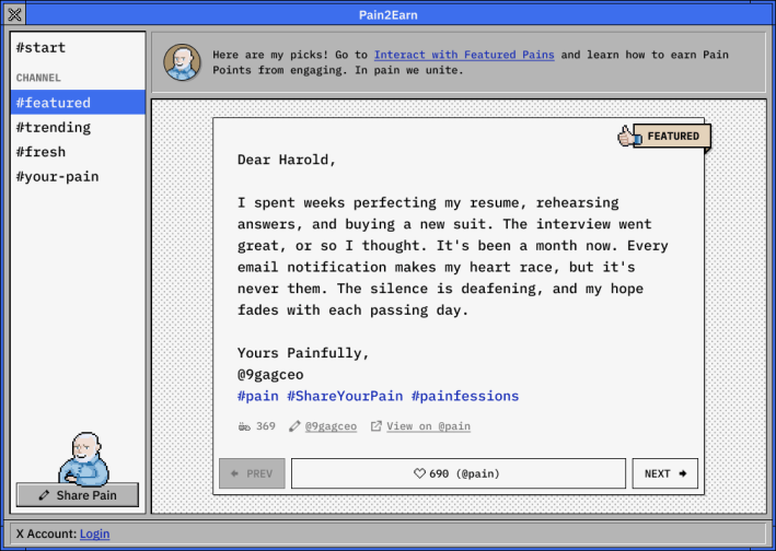
I explored various directions: modern pop, Gen-Z, nostalgia, retro computer UI, etc. The Stickies × 90s Retro (Share Your Pain below) worked well for pain-sharing (we called it Painfession), but retro computer UI gave us more flexibility to house multiple features inside a familiar desktop metaphor.
The chosen direction:
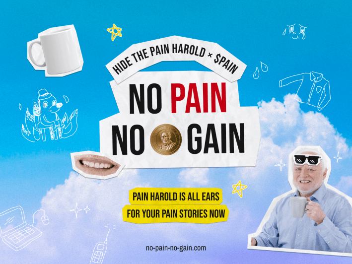
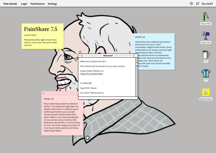
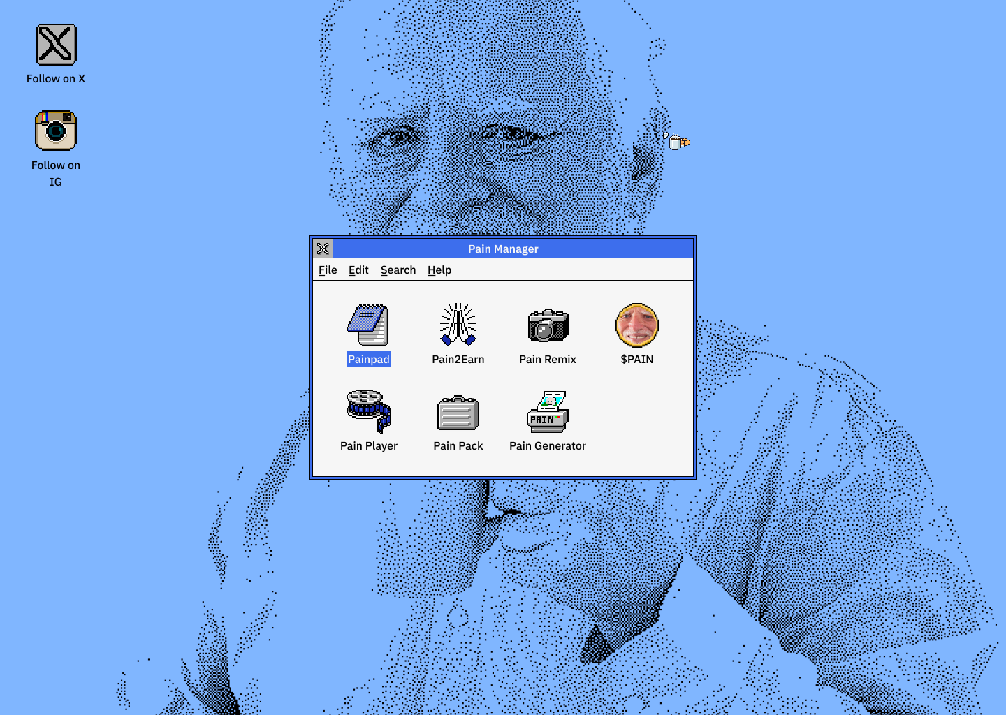
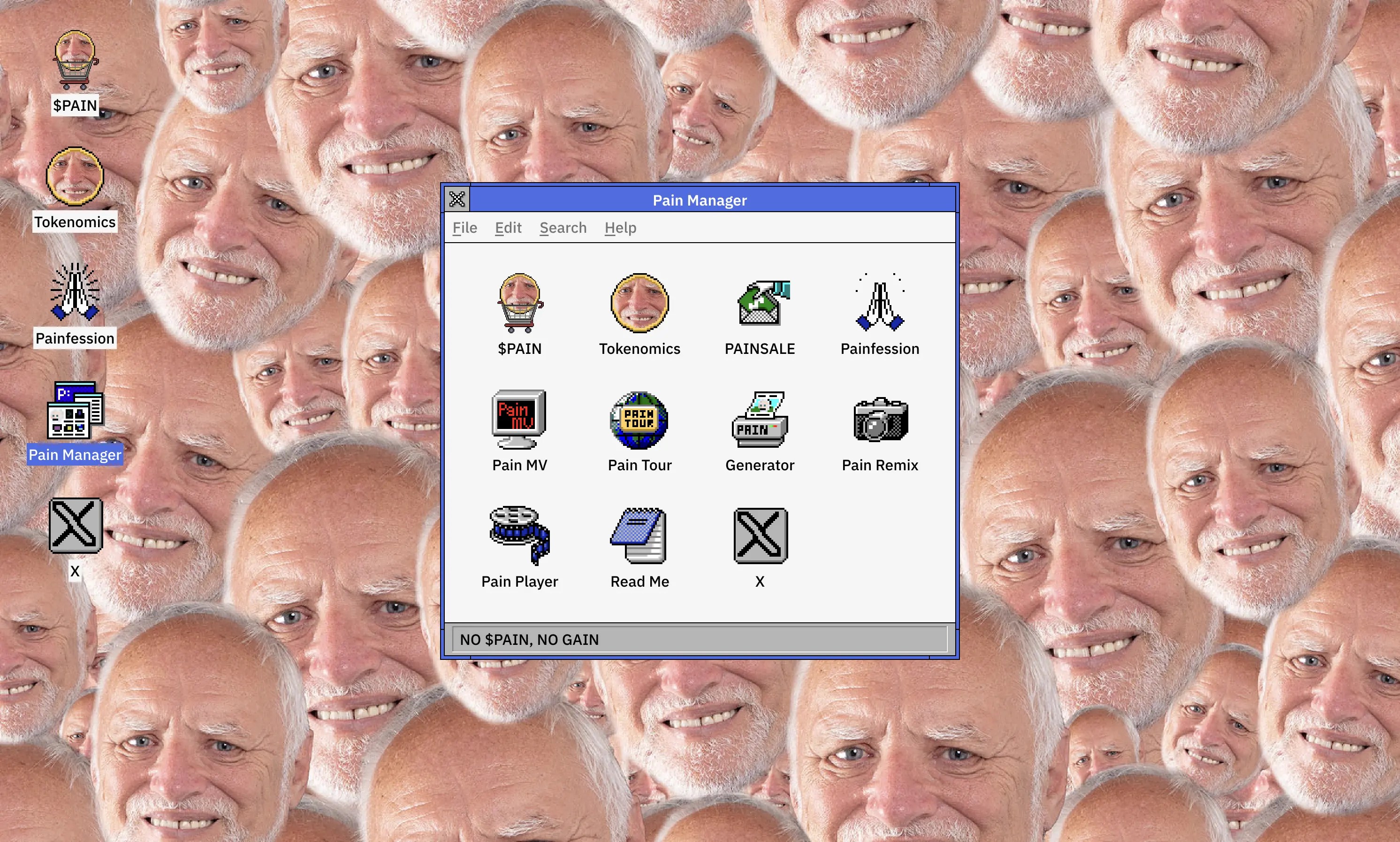
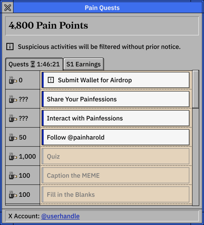
So we built a fully functional Windows 3.x desktop interface. Every feature lived in its own draggable window.
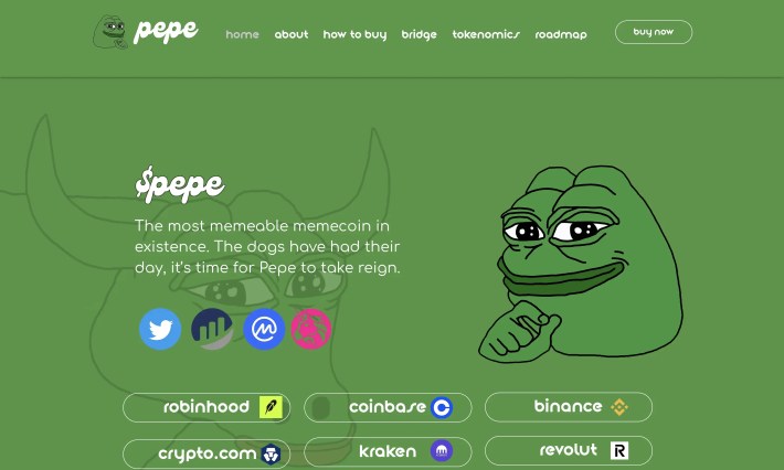
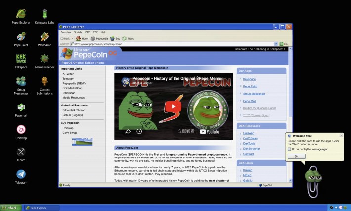
PepeCoin later followed the retro Windows OS approach. That validated our direction.
Feature Narrative Naming
I worked with the Head of Product to turn boring functional labels into narrative-driven apps:
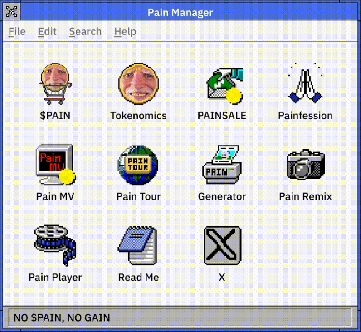
| Function | Traditional Label | Our Name |
|---|---|---|
| Navigation Menu | Menu | Pain Manager |
| Meme Generator | Generator | Pain Generator |
| Music Video | Video | Pain MV |
| Photo Gallery | Gallery | Pain Tour |
| Video Clips | Videos | Pain Player |
| Introduction | About | Read Me |
The “New Ugly” Call
*New Ugly means rejecting traditional perfection, using “distasteful” elements to make a visual statement.
After pre-launch, the team swapped my subtle blue background with a repeating Harold face pattern to maximise visual impact. I initially resisted—it challenges conventional aesthetics.
But meme coin audiences don’t want “beautiful” design. They want something so visually jarring that they want to share it. The “ugliness” became the point.
Constraints & Collaboration
When Everything Changed
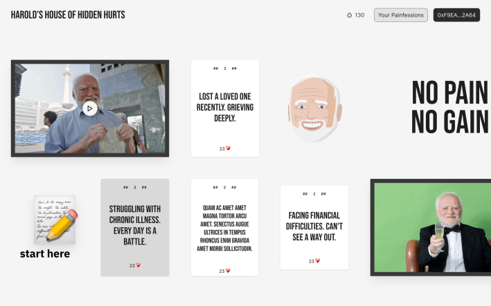
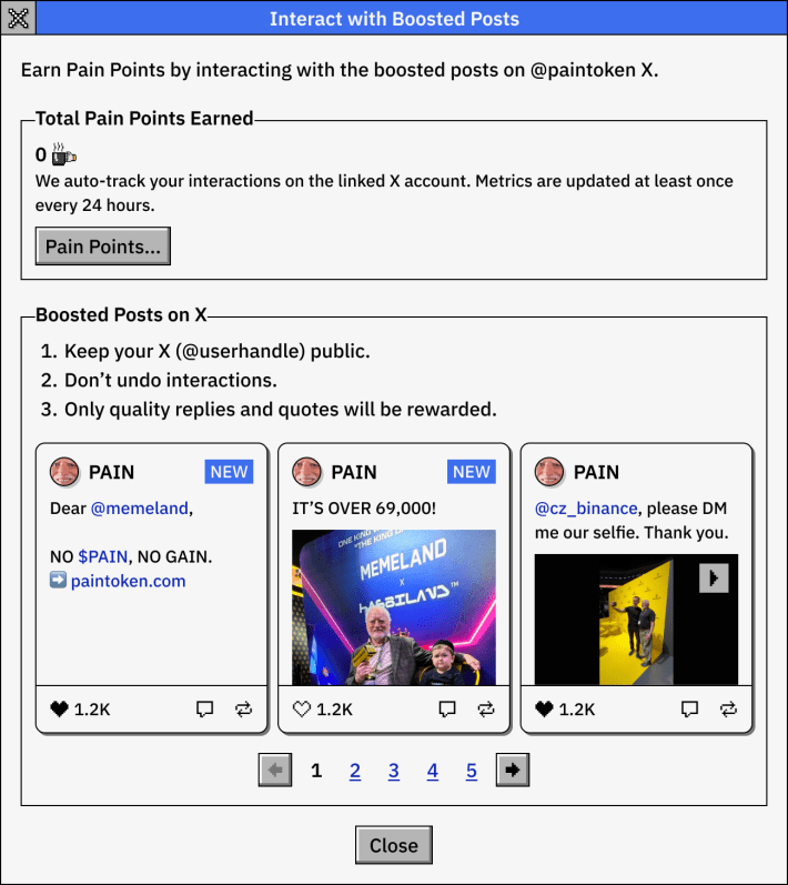
We spent months building Pain Quests and the Painfession system. Then we got 48 hours’ notice for the presale airdrop. We had to pivot hard: Painfession submissions moved to X and a web form. Only side features stayed on the website.
Features built but couldn’t be launched:
Working with Everyone
- Head of Product: Translated concepts into narrative experiences
- PM: Nailing down requirements for complex flows
- Designer: Delegated features while checking quality
- CEO: Adapted to direct design feedback, making sure implementation matched intent
I also set the art direction and built social media templates, OG images and meta tags for consistency across channels.
The Solution
The final $PAIN site was a fully interactive Windows 3.x desktop (and mobile version) where users could:
- Experience authentic retro interactions: Draggable windows, pixelated graphics and period-appropriate typography.
- Engage with narrative-driven features: Use features wrapped in Harold’s meme mythology.
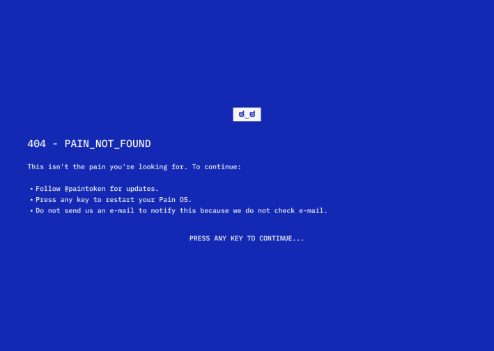
- Discover Easter Eggs: Find easter eggs on unready features and the 404 page.
The design showed how UI aesthetic shapes how users perceive and interact with the story.
Outcome & Impact
- Record-breaking presale: 185,976 $SOL raised in 48 hours. Highest meme coin presale at the time.
- Business outcome: Established Stakeland’s credibility. That led to implementation, marketing, GTM and consulting opportunities.
- Industry influence: PepeCoin’s later Windows XP interface proved we were onto something.
What I took away
Scope resilience
The six-month pivot taught me that in crypto, stripping a product down to its essence in 48 hours is a survival skill. The Windows 3.x aesthetic carried the experience even when we had to cut most of the functionality.
The core learning
In meme coin design, “good UX” doesn’t always mean “intuitive and beautiful”. Sometimes it means creating something so visually arresting that users can’t help but share it, even if it breaks every rule.
| My Role | UI/UX Design Lead at Memeland/9GAG |
| Team | Head of Product, 1 PM, 4 engineers, 2 designers, 1 artist, 1 QA, marketing team |
| Time | ~6 months, pre-launch in Feb 2025 |
| Website | paintoken.com |
