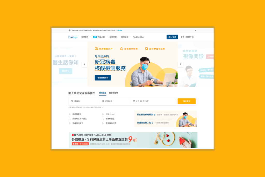
FindDoc was losing patients at the moment they were ready to book. Despite strong doctor listings, 44% of mobile users and 37% of desktop users bounced during search. They never made an appointment.
As Product Design Lead, I led the search redesign. We faced a short launch window and legacy backend constraints. I pushed for a phased approach that prioritised high-impact, low-effort changes first. Finally, bookings rose 70%.
The Challenges
FindDoc is Hong Kong’s health platform connecting patients with doctors across 40+ specialities. It is operated under significant limitations that shaped every design decision:
Problems
Data revealed a critical leak in the conversion funnel:
- High bounce rates: 44% on mobile, 37% on desktop during search.
- Low booking conversion: Only 3.2% of search visitors completed an appointment.
- Information overload: Users faced 6 filter categories and time slot selection before seeing doctor profiles.
- Poor SEO visibility: Ranked below page 2 for key medical speciality terms.
Better search meant more traffic. Traffic drove revenue. More visitors meant more ad impressions and more engagement with sponsored medical campaigns. We needed users to find doctors faster and book without friction.
Research
Before jumping into design, I invested time in understanding the business model. Through 1-on-1s with stakeholders, I learned that FindDoc’s website wasn’t primarily a revenue driver; the business runs on appointment bookings and advertising. It was a credibility and lead-generation tool for pharmaceutical partnerships. This insight reframed our success metrics:
While bookings mattered, page traffic and engagement were equally critical business outcomes.
It also explained why the CEO prioritised SEO visibility over conversion optimisation—a tension I had to navigate throughout the project.
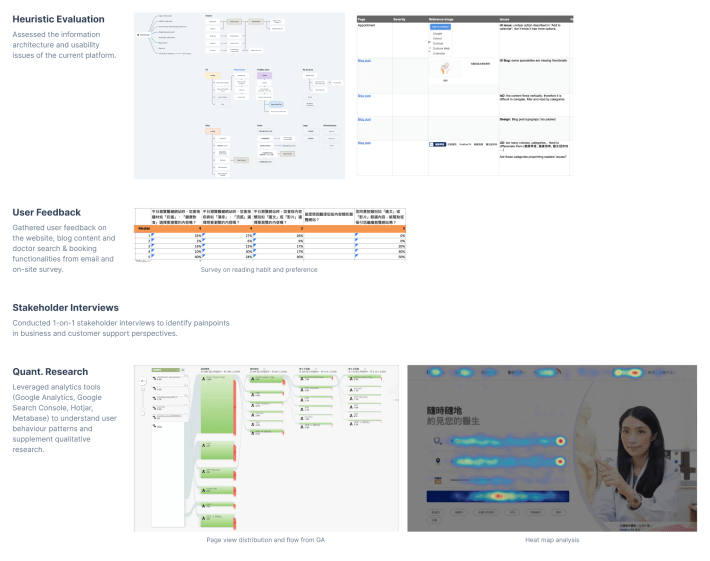
Apart from that, I also combined quantitative data with qualitative research:
| Method | Purpose | Key Findings |
|---|---|---|
| Stakeholder workshop | Align on goals, constraints | CEO prioritised page traffic over bookings |
| Website analytics | Identify drop-off points | 73% of searches were by speciality or doctor name; 68% exited at filter stage |
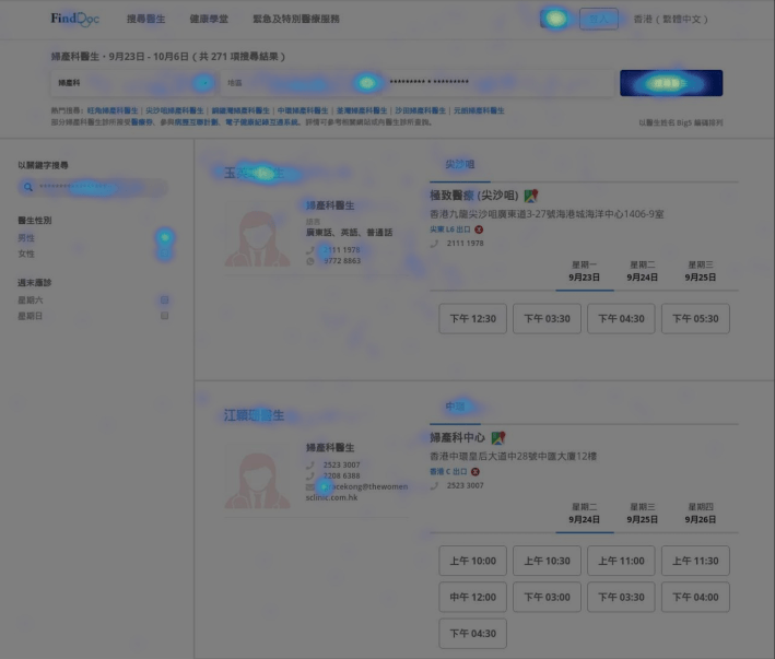
| Heatmaps & session recordings (Hotjar) | Reveal interaction friction | Users struggled with filter and information overload. |
| User personas (4 segments) | Clarify mental models | Patients prioritise doctor credentials over availability. |
| Competitive analysis | Identify market gaps | Best practices from medical directory sites |
| Effort-Impact matrix | Prioritise initiatives | — |
Key Insights
Insight 1: Users want speed, not filters
Analytics showed 73% of searches were by speciality or doctor name. Yet the interface buried these options behind 6 filter categories. Users navigated a complex system for a simple task.
Design Solution: Surface speciality shortcuts and typeahead suggestions.

Insight 2: Choice overload killed conversion
Heatmaps revealed users spent more time staring at time slots before leaving. Users froze when forced to pick a time slot before viewing doctor profiles.
Design Solution: Move time slot selection to the profile page. Validate through A/B testing.
Insight 3: One size doesn’t fit all search behaviour
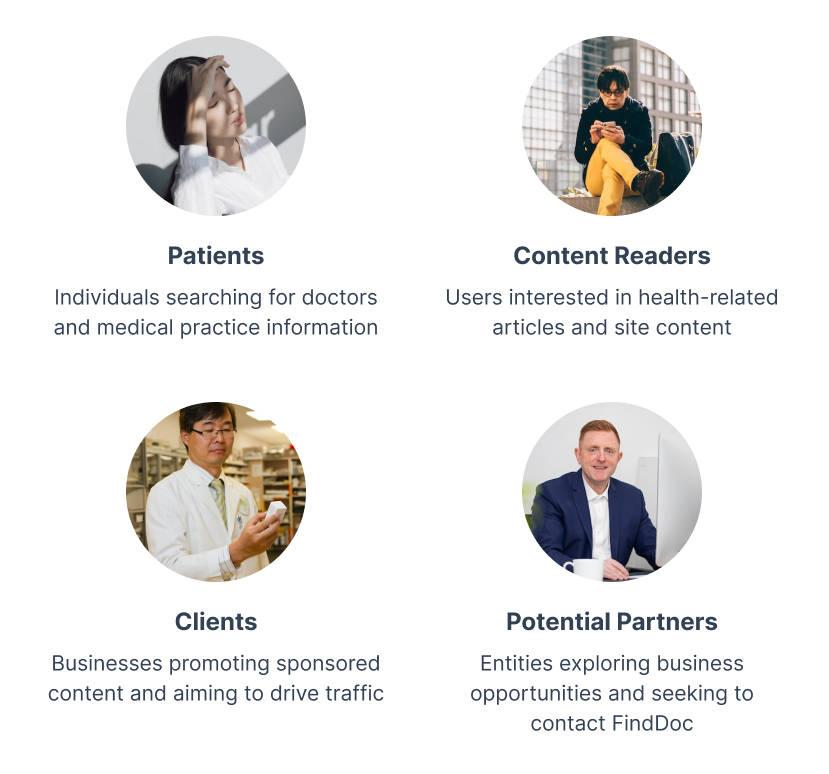
Through analytics and journey mapping, I identified three distinct search patterns that the original design failed to address:
- GP seekers: Knew exactly which doctor or practice they wanted → needed keyword search
- Specialist explorers: Browsing without a clear goal → needed filtering and comparison tools
- Healthcare content readers: Learn more about the disease → needed self-tests and health-related articles (marketing content)
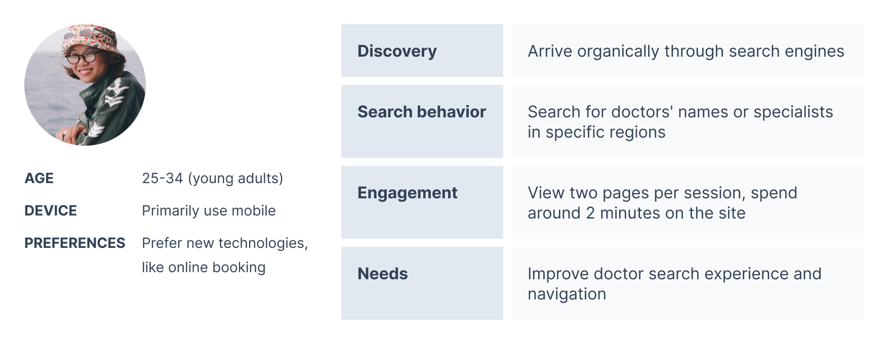
Design Solution: A flexible search interface supporting both keyword-driven and exploratory discovery modes, plus it is easy to locate content regarding healthcare or diseases within the homepage navigation and the above-the-fold area.
Design Approach
Navigating Constraints:
This project operated under significant limitations that shaped every design decision:
- Medical Compliance: Healthcare regulations restricted how we could display doctor information. For example, patient reviews and ratings — common on other doctor directories — actually are a legal grey area in Hong Kong. I worked closely with the team to ensure designs and content met requirements.
- Business Tensions: The CEO prioritised SEO visibility over conversion optimisation, a tension I navigated by demonstrating how UX improvements could serve both goals.
Cross-functional Collaboration:
- Engineering: I partnered with the engineering team to implement Google Optimize for A/B testing and wrote detailed interaction specs to reduce implementation ambiguity.
- Marketing & SEO: Aligned on keyword strategy and implemented schema markup for rich snippets.
- Content editors: Built disease-based categories (“Stomach pain” → Gastroenterologists) matching actual patient search behaviour.
The Solution
1. Information Architecture Refresh
The original homepage was designed as a directory, focused solely on doctor search. Heatmap analysis revealed users never scrolled past the fold, missing sponsored content and other business offerings.
So I proposed a fundamental IA shift: from directory to portal. Each section will only display a brief summary or limited content rather than showing all the full details. Like wayfinding signage, the new structure guides visitors to their desired destination while exposing the breadth of FindDoc’s ecosystem, driving internal traffic to previously overlooked content.

2. Simplified Search Experience
- Simplified filters: Only essential filters remained.
- Typeahead search: Predictive suggestions for doctor names and specialities.
- Popular specialities: Surface shortcuts based on search volume data.
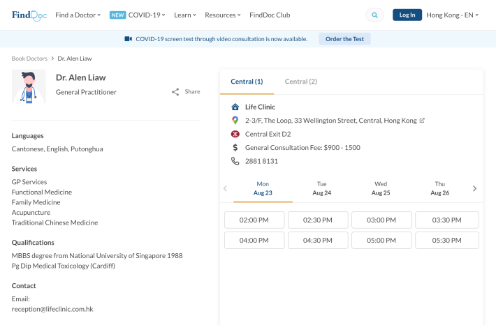
3. Streamlined Booking Flow

- Centralised doctor listings show more doctors per viewport.
- Clear CTAs: “View Profile” (primary) and “Book Now” (secondary).
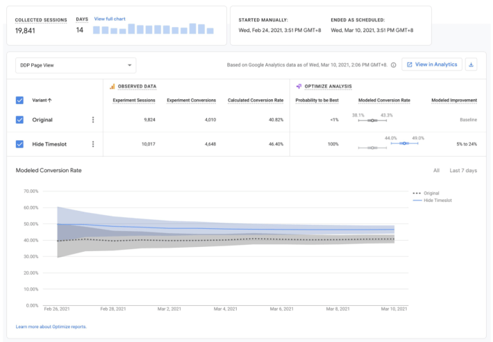
A/B Test: Removing Time Slots
Before full deployment, I designed a test to validate our most controversial decision: removing time slot selection from search results.
- Hypothesis: Users want to evaluate doctors before committing to a time
- Control: Original design with time slots in search results
- Variant: Time slots removed; CTAs only.
- Duration: 2 weeks, 50/50 split
Results:
| Metric | Change |
|---|---|
| Session duration | +3 seconds |
| Bounce rate | −2.9% |
| Doctor profile conversions | +5.6% |
Post-deployment (full rollout):
| Metric | Before | After |
|---|---|---|
| Bound rate | 55.2% | 44.97% (−19%) |
| Exit rate | 39.85% | 24.97% (−37%) |
| Button clicks | — | 77% “View Doctor”, 23% “Book Doctor” |
📖 Key learnings: Users wanted to learn about doctors before booking. The data validated our hypothesis and shaped future design decisions around progressive disclosure.
4. Navigation & Wayfinding
- Breadcrumbs on search results and profile pages.
- Clear back navigation that preserved filters.
5. SEO and Content Optimisation
- Disease-based categories mapped to patient search behaviour
- Schema.org markup structured markup data for rich snippets
- Content strategy: Key content placed above the fold. Crafted trilingual marketing copy (English, Traditional Chinese, Simplified Chinese) on the homepage to ensure clarity across Hong Kong’s diverse patient population.
FindDoc now ranks in the top 3 Google organic results for most of the key medical speciality terms in Hong Kong.

Outcome & Impact
| Metric | Before | After | Change |
|---|---|---|---|
| Appointment bookings | Baseline | – | +70% |
| Bounce rate (desktop) | 37% | 29% | −21.6% |
| Bounce rate (mobile) | 44% | 40% | –9.1% |
| Exit rate | 39.85% | 24.97% | –37% |
| Session duration (desktop) | 4’31” | 5’46” | +28% |
| Session duration (mobile) | 3’08” | 3’12” | +2% |
Learnings
What Worked:
- Data beats assumptions. The time slot removal was controversial. A/B testing gave us objective evidence and built stakeholder confidence.
- Progressive disclosure works. Users do not need all the information upfront. Deferring time slot selection reduced cognitive load and increased engagement.
- SEO is UX. Restructuring the information architecture for users simultaneously improved search rankings. What helps users helps SEO.
What I’d Do Differently:
- More qualitative validation. A/B testing confirmed the time slot removal worked, but follow-up interviews would have revealed more about user mental models.
| My Role | Product Design Lead at FindDoc (with PM responsibilities) |
| Platform | Desktop & Mobile Web |
| Responsibilities | UX research & analytics, interaction design, A/B testing, art direction, SEO strategy, cross-functional collaboration |
| Team | 1 PM, 5 engineers, 1 SEO specialist |
